Penguin Book Cover Art: The Perfect Gift for Bookworms
- by Timmy Loves
There are not many pieces of graphic design that a whole country can picture from memory. The Penguin paperback cover is one of them: three horizontal bands, orange at the top and bottom, white through the middle, a small bird in an oval. Ninety years on, you can put that layout in front of almost anyone in Britain and they will name it instantly.
That instant recognition is exactly what makes penguin book cover art such a good gift for a reader. It does not need explaining. It looks like a book they already love, except the author is them.
Where the Design Came From
A Station Platform in 1935
The origin story is famous enough to be slightly suspicious, but it holds up. Allen Lane, then a publisher at The Bodley Head, was waiting at Exeter St David's station after a weekend in Devon and found nothing on the bookstall worth buying — magazines, reprints of Victorian novels, and not much else. Good writing existed. Cheap, portable, well-made editions of it did not.
Penguin launched in July 1935 with ten titles at sixpence each, roughly the price of a packet of cigarettes. The list included Ernest Hemingway's A Farewell to Arms and Agatha Christie's The Mysterious Affair at Styles. The trade thought it was madness. Woolworths placed the order that made it work.
Edward Young and the Tri-Band Grid
The cover itself was drawn by Edward Young, a 21-year-old office junior at the time, who was also sent to London Zoo to sketch the penguins for the logo. What he produced was not decoration — it was a system. Three horizontal bands. Type centred in the white middle. Colour reserved entirely for information.
That last part is the clever bit. The colour of a Penguin was not a mood, it was an index:
- Orange — general fiction
- Green — crime and mystery
- Dark blue — biography
- Cerise — travel and adventure
- Red — plays and drama
- Yellow — miscellaneous
You could stand at a bookstall and read a shelf by colour before you read a single word. Very few pieces of packaging have ever worked that hard.
Tschichold Tightens the Screws
In 1947 Penguin brought in the Swiss-German typographer Jan Tschichold, who spent two years going through the entire list and writing what became the Penguin Composition Rules — a short, ruthless document about spacing, capitals, punctuation and alignment. He is the reason the type on a classic Penguin sits so calmly in that white band. Nothing is fighting anything else.
The Marber grid followed in 1961, when Romek Marber redesigned the green crime series and pushed the type into the top third to make room for an image. That grid then spread across the rest of the list. If you want the deeper version of this story, we wrote about the paperback revolution and why the design endured and about the typography legacy of Penguin Classics separately.
Why the Design Still Works on a Wall
Book covers are designed to survive being seen badly — at an angle, in poor light, on a crowded shelf, from three feet away. That is a much harder brief than "look nice framed", and it is why the layout translates to a print so cleanly.
- It is legible from across a room. The type is large, the contrast is absolute, and there is nothing behind it competing.
- It is one flat colour and one flat white. That means it sits happily against almost any wall colour, which busier art does not.
- It reads as a joke and as an object at the same time. The format is serious; whatever you put in it does not have to be.
- It does not date. The layout has been in continuous use since 1935. A print built on it is not going to look like 2026 in ten years' time.
How Personalised Penguin Book Art Works
The mechanics are simple, and the pleasure is in the writing rather than the design. You are filling in three slots on a layout that already works:
- The title. The main line in the white band. This carries the joke, the tribute or the in-reference.
- The author. Their name, sitting where Hemingway's would. This is the bit that makes people laugh out loud when they open it.
- The strapline. The small line of type at the bottom — the series note, the price, the "complete and unabridged". Underused, and where a lot of the charm lives.
Ours are printed in the same framed and unframed print formats as the rest of the range, from 21 x 29.7 cm up to A1, so you can pitch it as a small desk piece or as the thing above the reading chair.
Choosing the Title: What Actually Lands
This is where most people freeze, so here are the patterns that work, roughly in order of hit rate.
Their Catchphrase
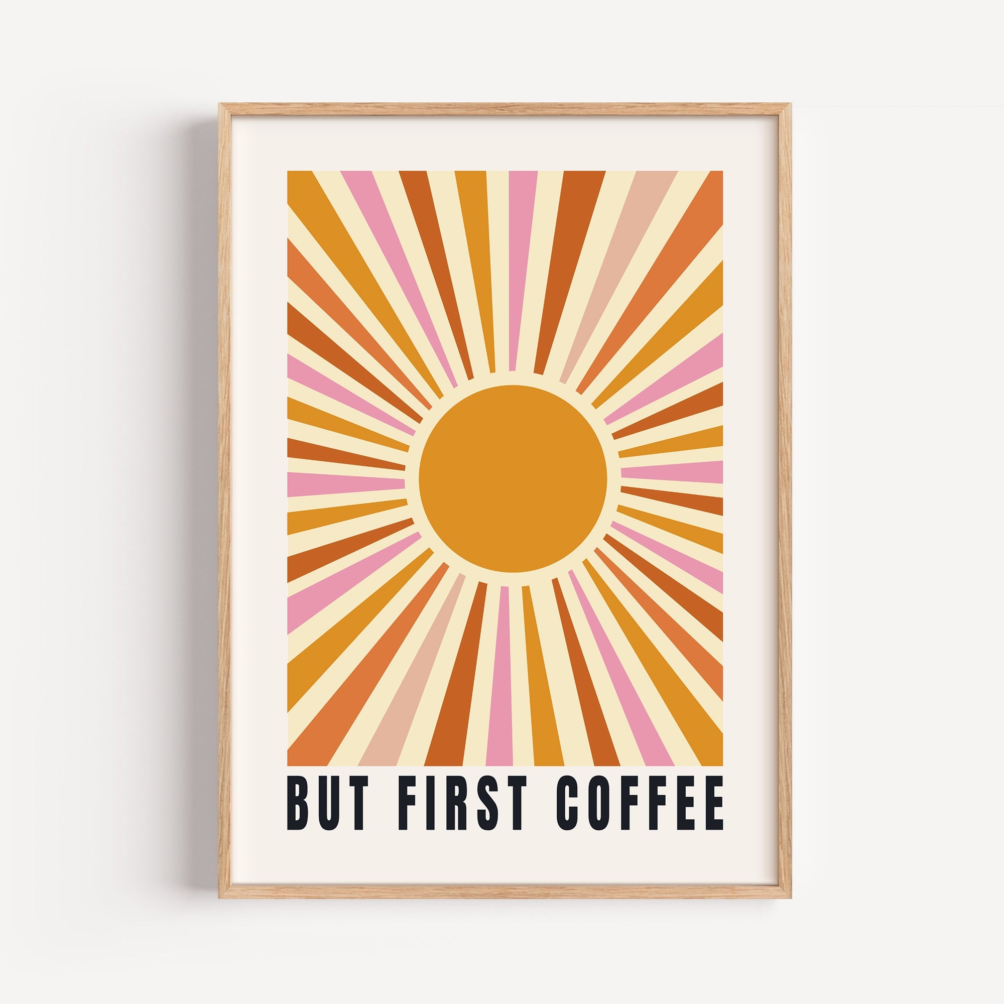
The line they say constantly and do not realise they say. "Just One More Chapter". "I'll Start It Tomorrow". "But First, Coffee". Set in Gill-ish capitals with their name underneath, an ordinary domestic phrase becomes a published work, and that gap is the entire joke.
Their Place
A town, a street, a holiday cottage they have been going to for twenty years. The Town Edition prints work like this — your place, treated as a Penguin travel title. It lands especially well for people who have moved away from somewhere they still call home.
Their Actual Ambition
Less funny, more moving. If they have been talking about writing a book for a decade, printing the cover of it is not a joke, it is a nudge. Give them the title they keep describing and put their name on it. This is the one that gets framed and kept.
The Affectionate Insult
"A Little Bit Dramatic". "Chronically Early". "A Little Sweary". Only for people who will enjoy it — but for those people it is the best card you will ever give them, and it happens to be a print.
A rule of thumb: read the title out loud with their name after it. If the two together make you smile, it is right. If you have to explain the connection, write it again.
Best Occasions to Give It
- Birthdays. The default, and it works because it is specific. Browse the rest of our personalised birthday gifts if you want to pair it with something.
- Graduations. Their degree subject as the title, their name as the author, the year as the strapline. It marks the thing without being a certificate.
- Teacher gifts. Far better than the mug. A title about their subject, or about surviving Year 9, with the class or year group in the strapline.
- Retirement. A career summarised as a book title is a genuinely good farewell present, and it survives the leaving do.
- Christmas. The safe one for a reader you do not know well enough to buy an actual book for — the risk of duplication is zero.
- Housewarming. The Town Edition, their new postcode, done.
Style Variations
Not every version needs to be orange. The variations worth knowing about:
- Colour by genre. Use the original coding. Green for the true-crime podcast obsessive, dark blue for the biography reader, cerise for the traveller. It is a private joke for anyone who knows the system, and just a nice colour for anyone who does not.
- Aged versus clean. A softened, foxed finish reads as a charity-shop find; a crisp modern print reads as design. Pick by room, not by preference — aged suits wood and warm walls, clean suits white ones.
- Sets of three. Three covers in three colours, hung in a row, is one of the easiest gallery arrangements there is, because the grid does the alignment work for you. More on that in our gallery wall guide.
- Mixed with other type-led prints. Penguin covers sit well beside plain word art prints because both are type on flat colour. They do not sit well beside photography.
How to Order
Pick the design from the Penguin book cover art collection, choose your size, and enter your title, name and strapline in the personalisation boxes. Check the spelling of the name twice — it is the one thing on the print that cannot be forgiven. Then choose framed or unframed; if you are unsure which, our framing guide covers the trade-offs.
Prints are made to order, so allow for production as well as delivery when you are buying for a date. For the reader who has every book they want and no wall space left, this is the one thing they cannot already own.
Also worth a look: our alphabet art design guide, and if you are buying for someone whose obsession is a football club rather than a bookshelf, our list of football gifts that aren't a shirt.