Alphabet Art Prints: From A to Z, a Design Guide
- by Timmy Loves
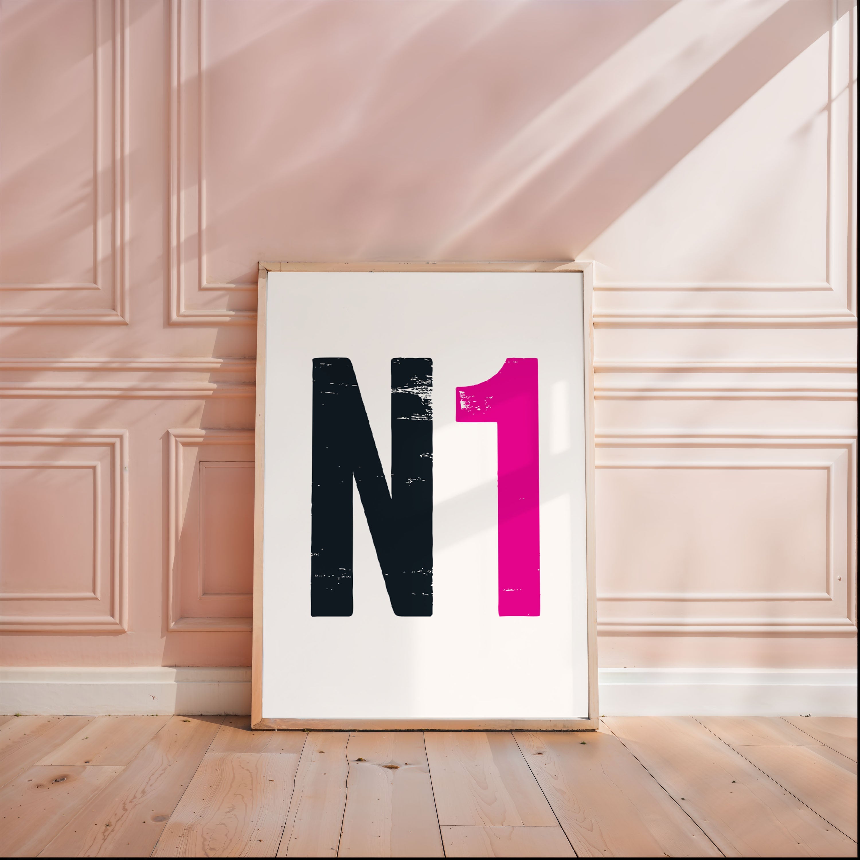
Alphabet art is one of the few kinds of wall art that is personal and abstract at the same time. A single letter says exactly who a room belongs to, while still just being a shape — which is why it works in a nursery, an office and a hallway without changing register.
It is also easy to get slightly wrong. A letter is a piece of typography blown up to a size typography was never designed for, and at that scale the differences between letters start to matter. This is a practical guide to choosing and arranging alphabet art prints, including the bit most guides skip: some letters are simply better on a wall than others.
What Alphabet Art Actually Is
Two different things share the name, and they behave differently.
- Single-letter prints. One character, treated as the subject rather than as text — a marquee letter, a letterpress capital, a painted initial. The letter is the image.
- Full-alphabet prints. All twenty-six set as a grid or a chart, often in a nursery or a study. Here the appeal is the system rather than any one character.
Single letters are the personal option; full alphabets are the decorative one. Most of what follows is about single letters, because that is where the choices are.
Where It Works
Children's Rooms
The obvious use and still the best one. A child's initial is the first piece of written language they recognise, usually well before they can read anything else, so a big letter on the wall is doing something no other print does — it is genuinely theirs in a way they can verify.
Practical advice: hang it low. Nursery art is routinely hung at adult eye level, where the person it is for cannot see it properly. There is more on style choices for a nursery in our nursery alphabet art guide, and the rest of the new baby gift range pairs with it.
Gallery Walls
Family initials as a set is one of the easiest gallery walls to pull off, because you have solved the hardest problem before you start: every print is the same subject at the same weight, so the arrangement cannot look random. Add or replace a frame as the family changes.
Wedding and Anniversary Gifts
Two initials, or a shared surname letter. The restraint is the point — a monogram says the same thing as a print of both names and a date, but quietly, and it does not have to come down if the styling of the room changes. Worth a look alongside the wedding gift collection.
Offices and Studies
A single initial is about the only way to personalise a workspace that survives being on a video call. It reads as design rather than decoration, which is a real distinction when the room is also a professional backdrop.
Hallways and Front Doors
A surname initial by the door is an old idea and a good one. In a narrow space where you only ever see art from an angle, a single high-contrast character is one of the few things that still reads properly.
Choosing a Style for Your Letter
The style should follow the letter, not the other way round. Some pairings work and some fight.
Marquee and Bulb Letters
Warm, theatrical, slightly fairground. They suit letters with big enclosed shapes — O, D, B, Q, R — because the bulbs have somewhere to sit. On a thin letter like I or J there is not enough form to carry the effect.
Letterpress and Wood Type
Heavy, ink-on-paper, faintly industrial. Flattering to almost every letter, and the safest choice if you are buying for someone else. Works best in a room with some wood or texture already in it; against a pure white minimalist wall it can look like it has wandered in from another house.
Clean Modern Sans
The most versatile and the least characterful. Choose it when the letter is doing a job rather than being the feature — a set of four family initials, or a print that has to coexist with a lot of other art.
Script and Calligraphic
Beautiful on some letters and illegible on others. S, L, G and J are lovely in script. M, W and N tend to turn into a tangle at large sizes. Test by squinting: if you cannot identify the letter with your eyes half shut, it is too decorative.
Black and White Versus Colour
Black and white lets the shape do the work and never clashes with anything. Colour makes the print a colour accent first and a letter second — which is the right call in a child's room and usually the wrong one in a hallway.
Which Letters Work Best on a Wall
This is not superstition, it is geometry. Letters vary enormously in how much of their bounding box they fill, and that determines how well they hold a frame.
- The strong ones: O, A, M, W, S, B, G, R. Wide, closed or symmetrical shapes that fill the frame and read from across the room. O and S are the two most forgiving of any style.
- The tricky ones: I, J, L, T, Y. Thin, top-heavy or bottom-light, so they leave big empty areas and can look like a mistake in a large frame. Fix them by going smaller, choosing a heavy letterpress weight, or setting them on a coloured ground so the negative space becomes deliberate.
- The awkward one: Q. The tail throws the balance off-centre in almost every typeface. Worth choosing the style around the letter here rather than the reverse.
None of this means you cannot have the letter you need — you obviously cannot pick a child's initial for aesthetic reasons. It means a J deserves a bit more thought about weight and size than an O does.
Arranging Multiple Letters as a Set
The rules are simple and the mistakes are common.
- Same style, same size, same frame. A set is a set because the treatment is identical. If you want variety, get it from the wall arrangement, not from mixing styles.
- Odd numbers on a wall, even numbers in a row. Three or five in a loose cluster; two or four in a straight line. Four in a cluster tends to read as a square and stops the eye.
- Keep the gaps tight and equal. Five to eight centimetres between frames for A4-sized prints. Wide gaps break the set back into separate prints.
- Do not spell the name. Initials in family order look intentional; a full name spelled out in framed letters reads as signage. The exception is a very short name in a nursery.
- Hang the row's centre line at eye level — about 145 cm — not the top edge. This is the single most common hanging error.
If you are building something larger around them, the gallery wall guide covers the layout maths in more detail.
Sizes and Formats
A letter needs more size than a text print does, because there is only one thing to look at. As a rough guide: 21 x 29.7 cm for a desk or a shelf, A3 for a set of initials on a wall, A2 or A1 for a single letter as the feature of a room. Our print and canvas formats run to A1, and the framing guide covers whether to buy it framed.
Gifting Occasions
- New babies and christenings. The default, and it stays relevant for years longer than most nursery decor.
- Weddings and engagements. Paired initials, or the new shared surname letter.
- Milestone birthdays. A single heavy initial is a good present for someone who says they do not want anything. See the birthday gift range.
- Moving in together. Two initials, one wall, no argument about whose taste it reflects.
- Teenagers' rooms. One of the few personalised prints that a fifteen-year-old will not immediately take down.
There is a longer list of angles in our alphabet art gift guide.
The Short Version
Pick the letter you have to pick, then choose the style to suit its shape rather than the room's. Go bigger than feels necessary. Keep sets identical and their gaps tight. And if the letter is a thin one, add weight rather than size.
Start with the alphabet art collection, or browse the wider word art range if you would rather have a phrase than a character.
Related reading: our guide to personalised Penguin book cover art.