How to Create the Perfect Gallery Wall with Personalised Prints
- by Timmy Loves
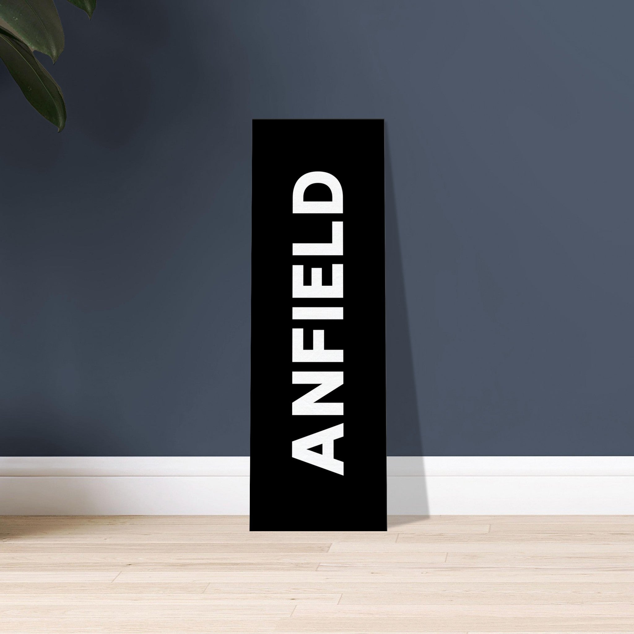
A gallery wall is the best use of personalised prints there is, because it turns a collection of small individual things into one large deliberate thing. It's also where most people put twenty holes in a wall and end up with something that looks like a noticeboard.
The difference is entirely method. Work through these steps in order and the wall assembles itself.
Step 1: Choose One Thread That Holds It Together
Every gallery wall that works has exactly one unifying constraint. Pick one and let everything else vary.
Unify by Subject
All music, all football, all family. A wall of song lyric prints spanning different artists still reads as one collection because the subject is consistent.
Unify by Palette
Subjects can range widely if the colours don't. Monochrome plus one accent is the most forgiving palette in existence, and lets a stadium print sit next to a postcode print without argument.
Unify by Format
The same frame in every size, or the same typographic style throughout. This is how Penguin book cover art works so well on a gallery wall — the format is the theme, so ten different titles still read as a set.
Step 2: Measure the Wall Before You Choose Anything
Find the usable rectangle — the space bounded by door frames, corners, switches and furniture. Your arrangement should fill about 60–75% of that width and never creep past the ends of the furniture below it.
Write the numbers down. Every later decision depends on them, and "it looked about right" is how walls end up lopsided.

Step 3: Mix Sizes, But Anchor First
Uniform sizes make a grid; varied sizes make a gallery. The rule is one clear anchor.
Choose your largest piece — A1 or a canvas — and place it slightly off-centre, roughly a third of the way in. That's your anchor. Build outward with A2s, then fill gaps with A3 and A4. A good ratio for a seven-piece wall is one large, two medium, four small.
Without an anchor, the eye has nowhere to land and the whole arrangement reads as clutter. A stadium or Monopoly-style print makes a strong anchor because it carries visual weight and personal meaning at once.
Step 4: Pick a Layout
The Grid
Equal sizes, equal gaps, straight lines. Formal, calm, and the most forgiving of all layouts — if your pieces are the same size, this is the one. Ideal above a sideboard or in a home office.
The Salon Hang
Mixed sizes packed tightly around a strong centre, growing organically outward. Warmer and more collected-over-time, but it needs consistent spacing to stop looking accidental. Best in living rooms and up staircases.
The Horizontal Run
A single line of prints at one consistent centre height, evenly spaced. Perfect for hallways and landings, where you view art at an angle and a tall arrangement can't be seen properly.
The Staircase Diagonal
Follow the stair pitch, keeping the gap between each print and the stair nose constant. The line of the frames should run parallel to the bannister, not step up in a zigzag.
Step 5: Mixing Canvas and Framed Prints
You can absolutely mix the two — with one caveat. Because canvas has no frame, it reads as visually lighter than a framed print of identical size, so it recedes if you dot several small ones through the arrangement.
Two approaches work. Either make the canvas your large anchor piece and frame everything else around it, or keep canvas and framed pieces in distinct clusters rather than alternating. What doesn't work is scattering them one-for-one — the wall loses its rhythm. Our guide to personalised framed prints covers frame finishes in more depth.
Step 6: Coordinate Colour Across the Whole Wall
Treat the arrangement as one piece of art, not eight. Two practical rules:
- Distribute, don't cluster. If three prints carry a red accent, spread them across the arrangement so the eye travels. Three reds bunched in one corner tip the whole wall.
- Balance visual weight diagonally. A dark, dense print in the top left wants something equally weighty in the bottom right.
Keep the mount colour and frame finish consistent throughout, even when print styles vary — that consistency is what buys you freedom elsewhere.
Step 7: Template It Before You Pick Up the Hammer
This step is not optional, and it's the one everyone skips.
- Lay every print out on the floor in front of the wall and rearrange until it looks right. Photograph the arrangement.
- Cut newspaper or paper templates to the exact size of each frame.
- Tape the templates to the wall with masking tape and live with them for a day.
- Adjust, then mark the hanging point through each template before removing it.
Keep gaps at a consistent 5–8cm throughout. Tighter than 5cm and it reads as crowded; wider than 10cm and the pieces stop reading as a group.
Hanging Tips That Save the Plaster
- The centre of the whole arrangement — not of any individual print — should sit at 145cm from the floor.
- Measure from the taut hanging wire or hook to the frame top, then subtract that from your marked centre. Frames hang lower than you expect.
- Use two hooks per frame on anything A2 or larger. It stops the tilt that otherwise needs correcting weekly.
- On plasterboard, self-drive fixings hold far more than picture pins. On solid brick you need a drill — pins will crumble the plaster.
- Adhesive strips work on light A4 and A3 frames only, and not in bathrooms or kitchens where steam breaks the bond.
Three Mistakes Worth Avoiding
Filling the wall on day one. The best gallery walls grow. Start with five or six pieces and leave room to add.
Making everything equally important. Without a clear hierarchy, nothing stands out. One anchor, then supporting pieces.
Hanging too high. Worth repeating, because it's the most common error of all — and on a gallery wall it's multiplied across every piece.
Where to Start
Pick the anchor first — the piece with the most personal meaning and the most visual weight — and build around it. If you're still deciding on sizes and heights for the room in general, our complete home styling guide covers the fundamentals, and why word canvas beats photo canvas explains why text-based pieces hold a gallery wall together better than photographs.