Custom Canvas Prints with Words: Why Text Art Beats Photo Canvas Every Time
- by Timmy Loves
Search for custom canvas prints and you'll get a wall of the same thing: upload a photo, pick a size, done. It's the default, and for fifteen years it's been the default for a reason — it was the first genuinely easy way to get something personal onto a wall.
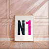
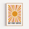
But defaults get tired. Walk into ten homes and you'll see the same wedding photo stretched across the same three-panel canvas above the same sofa. Meanwhile canvas prints with words — lyrics, quotes, names, dates, in-jokes — have quietly become the more interesting choice. Here's the honest case for text over photo, including where photo canvas still wins.
The Problem With Photo Canvas
Everybody Has the Same One
Photo canvas is personal to you and generic to everyone else. The image is unique; the format isn't. A large photographic canvas above the sofa reads as a category of decor before it reads as your family — which is why so many end up moved to the landing within two years.
Photographs Date Faster Than You Think
This is the one nobody warns you about. A photo canvas is locked to a moment: that haircut, that phase, that partner, that version of the living room. Fashions in photography date too — the heavy vignette and warm filter that looked current in 2016 now timestamps a print as precisely as a font does.
Words don't do this. A lyric that mattered to you in 2016 still reads as a lyric in 2036. Text art ages into itself instead of out of style.
Bright Rooms Are Unkind to Photographs
Photographic canvas depends on subtle tonal gradation — skin tones, skies, shadow detail. That's exactly what direct sunlight flattens first. Typography is high-contrast by design, so a word canvas holds its impact in a bright bay window long after a photo canvas has gone muddy.

What a Word Art Canvas Does Differently
It Starts a Conversation Instead of Ending One
A photograph on a wall is a closed statement — here is my family, here is Santorini. Lovely, but there's nowhere for a visitor to go with it beyond "nice photo".
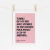
A song lyric print does the opposite. Someone spots the line, recognises it, and you're three minutes into a conversation about the gig you saw it played at. The art is doing social work that a photograph can't.
It Works as Decor First, Personalisation Second
This is the real structural advantage. A word canvas is a piece of graphic design — it has composition, balance, negative space, a considered palette. It earns its place on the wall on visual terms alone. The fact that the words are yours is a bonus layer, not the only thing holding it up.
A photo canvas has it the other way round: strip out the personal meaning and you're left with a large picture of some people. That's why word art survives a redecoration and a house move, and photo canvas often doesn't.
It Scales Across a Whole Wall
Three photo canvases together compete — three focal points fighting for the same attention. Three typographic prints in a shared palette read as one designed set, which is why text art is the backbone of most our gallery wall guide. Format consistency does the heavy lifting.
The Text That Works Best on Canvas
Song Lyrics
The strongest category, because a lyric carries meaning you didn't have to manufacture. First dance lines, the song from the road trip, the chorus that got you through a bad year. Keep it to one or two lines — a full verse becomes a page of text, and a wall is not a page.
Quotes and Sayings
The bar is higher here. A genuinely well-known motivational quote is the typographic equivalent of a stock photo. What works is the specific: something a grandparent always said, a line from a film only your household quotes, the phrase that became a running family joke.
Names, Dates and Places
The most reliably timeless option. A surname with an established-year, a postcode, a wedding date, a stadium and a scoreline. These read as heraldic rather than sentimental, which is why they suit hallways and living rooms where you want personal but not soft.
Where Photo Canvas Still Wins
Being fair about it: photo canvas is the better choice in three situations. For a memorial piece, where the image itself is the point. For children's rooms, where a photograph of a pet or a grandparent does something typography can't. And for genuinely striking photography — a landscape you shot yourself, printed large — which is a different proposition from a phone snap enlarged past its resolution.
The argument isn't that photographs don't belong on walls. It's that the default choice has become photo canvas by habit rather than by decision, and for most rooms text is the stronger piece of decor.
Choosing Words That Won't Wear Out
- Read it out loud. If it sounds like a greetings card spoken aloud, it will look like one at A2.
- Cut it shorter than feels right. Almost every text that fails on a wall fails for being too long. Six to twelve words is the sweet spot.
- Choose meaning over mood. "Live Laugh Love" is a mood. A date and a place is a fact — and facts don't go out of fashion.
- Check it still works without explanation. If the piece only makes sense once you've told the story, it's a keepsake, not wall art. Ideally it's both.
Print Quality Still Matters
Typography is unforgiving of a cheap print in a way photographs aren't — soft edges on a letterform are instantly visible, where softness in a photo just reads as depth of field. Look for a genuine cotton-blend canvas, a solid stretcher bar that won't bow, and crisp edge-to-edge letter definition. Every canvas and print we make is produced to order in the UK with free delivery, so nothing sits in a warehouse fading before it reaches you.
If you've decided text is the way to go and want the practical detail — sizing, layout options and canvas versus framed — our complete guide to personalised canvas prints with words covers the ordering side, and our complete home styling guide shows how to place it once it arrives.
The Short Version
Photo canvas captures a moment. Word canvas captures a meaning — and meanings don't need re-shooting when the haircut changes. If you want something on the wall that still feels right in a decade, put the words up.