Small Hallway Prints
- by Timmy LovesArt
Small Hallway Prints: The Smart Way to Transform Narrow Spaces with Pictures for Hallway Walls in 2025
Let's be honest: most hallways are afterthoughts. You rush through them carrying laundry, dodging around that awkward corner, maybe glancing at the boring white walls. But what if that neglected corridor could actually become one of your home's most charming spaces?
That's exactly what small hallway prints can do. And trust me, after seeing hundreds of hallway transformations, the difference is night and day.

Why Small Prints Are Perfect for Hallway Pictures (And Big Ones Usually Aren't)
Here's the thing about narrow hallways - they're tricky. One large piece can overwhelm the space or be impossible to view properly as you walk past. But small prints? They're like the perfect puzzle pieces for awkward spaces.
Small prints work because they don't compete with the architecture. Instead, they enhance it. A client once told me her hallway felt "claustrophobic" with one large landscape print. We swapped it for three smaller botanical prints, and suddenly the space felt twice as wide.
The magic happens because your eye can take in the whole composition without strain. Plus, smaller pieces are way more budget-friendly - you can create an entire gallery for the cost of one large custom piece.
What's Actually Working in 2025 Hallway Design
Forget everything Pinterest told you about white walls and black frames. This year's hallway trends are getting bold, and small prints are leading the charge.
The "rotating gallery" trend is huge right now. People are using clipboards, magnetic panels, or simple ledges to swap out artwork seasonally. It keeps hallways fresh without the commitment of permanent gallery walls.
Mixed media displays are everywhere too. Think small prints combined with mirrors, floating shelves with plants, or even vintage finds from charity shops. The key is creating layers without clutter - which sounds contradictory but totally works when done right.
Color isn't scary anymore: Deep terracotta, forest green, even bold navy are replacing those safe beige walls. Small prints actually look more sophisticated against rich backgrounds than you'd think.
The Psychology Behind Hallway Pictures (Yes, There's Science)
You walk through your hallway multiple times every day. Those quick glimpses of artwork actually add up to significant mental impact over time.
Small prints work particularly well because they're "bite-sized" inspiration. Your brain can process the image quickly during transit, but there's enough detail to notice something new occasionally. It's like having mini mood boosts built into your daily routine.
For families, hallway pictures become part of the home's narrative. Kids grow up seeing those images daily, adults get familiar comfort from recognizing the artwork during stressful moments. The hallway becomes less of a passage and more of a transition space that sets the tone for wherever you're heading.

Choosing Pictures for Hallway Walls That Actually Work
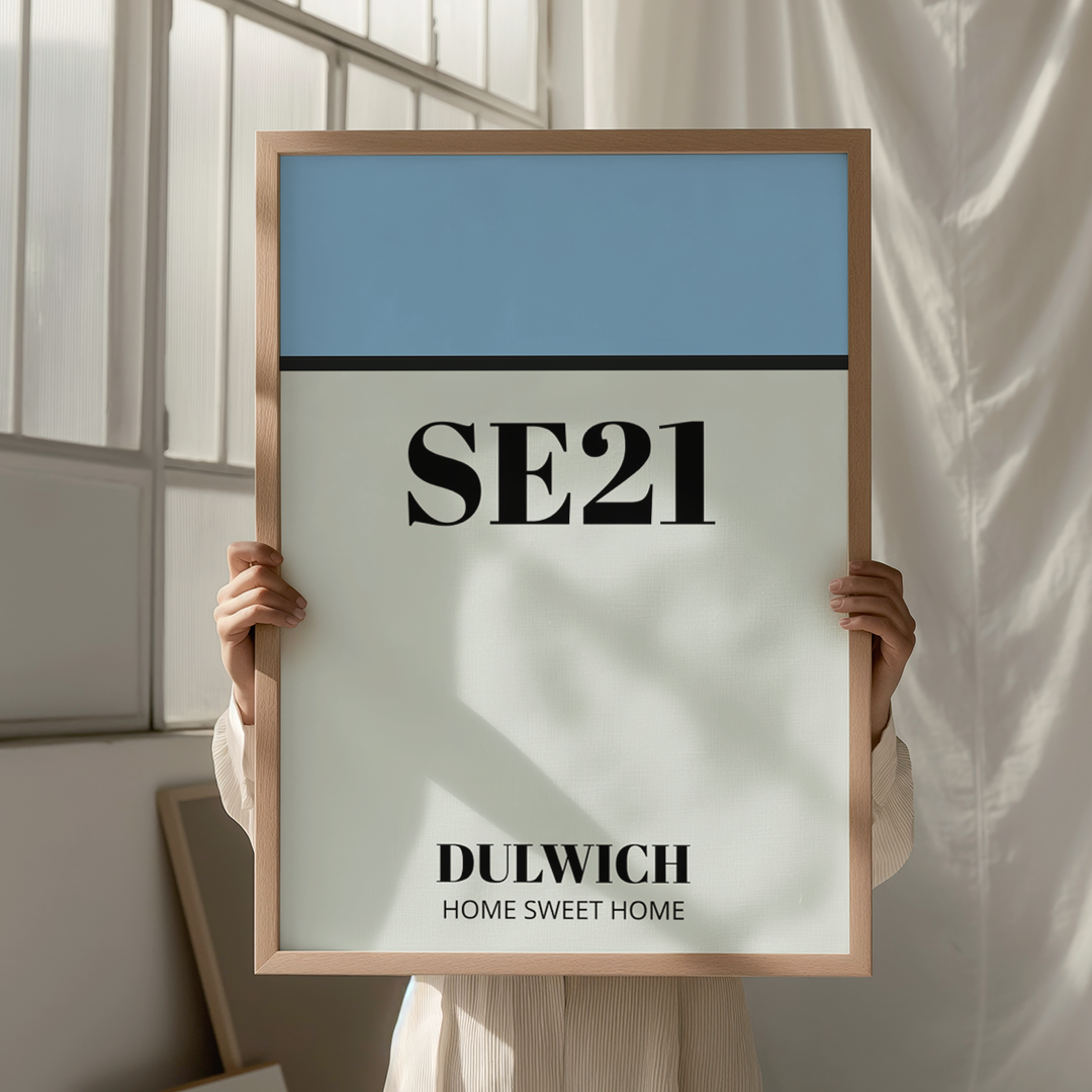
For narrow hallways under 4 feet wide: Skip the gallery wall. Go with 1-3 similar pieces in a line. Portrait orientation works best - it draws the eye up and makes low ceilings feel higher. Think botanical prints, simple landscapes, or family photos in matching frames.
For standard hallways (4-6 feet): This is gallery wall territory. Mix 4-6 smaller pieces, but keep them related somehow - same color palette, similar themes, or matching frame styles. Abstract prints work brilliantly here because they don't compete with the busy-ness of people walking by.
For longer corridors: Create visual "zones" with clustered prints rather than spacing them evenly down the entire length. It's more interesting and prevents that "hotel corridor" feeling.
The lighting reality check: Can you actually see the pictures? Hallways are notoriously dark. If you can't read the details on your prints, they're just expensive decorations. Add picture lights, use lighter frames, or choose high-contrast images that pop even in dim lighting.
Budget-Smart Approaches That Look Expensive
You don't need to drop hundreds on original art. Some of the best hallway transformations I've seen used clever mix-and-match approaches:
The £30 gallery wall: Five small prints from Etsy (£6 each), simple frames from IKEA, and boom - instant sophistication. The trick is sticking to one color story so everything feels intentional.
The personal touch route: Family photos, kids' artwork, or vacation snapshots in matching frames can look incredibly sophisticated. The key is editing ruthlessly - not every photo makes the cut.
The vintage hunt: Charity shops and car boot sales are goldmines for unique small prints. Mix different eras and styles, but keep frame colors consistent. It looks curated rather than random.
The DIY digital approach: Download high-resolution vintage botanical illustrations (many are copyright-free), print them at your local photo shop, and frame them yourself. Total cost: under £50 for a whole hallway.

Placement Secrets That Make or Break the Look
Eye level is everything: But whose eye level? The average person's eye level is about 57-60 inches from the floor to the center of the artwork. In hallways, err on the slightly lower side since people are moving, not standing still to admire.
The spacing sweet spot: 2-3 inches between frames in a group, 6-8 inches between different groupings. Too close feels cramped, too far apart loses cohesion.
Consider the angles: Hallways are viewed from multiple directions. What looks perfect from one end might be awkward from the other. Walk the space before committing to placement.
The furniture factor: If you have a console table or bench, hang artwork 6-8 inches above it. No furniture? The standard eye-level rule applies.
Common Mistakes (That Everyone Makes)
Going too small: Yes, we're talking about small prints, but "small" doesn't mean tiny. A 5x7 print on a long hallway wall will look lost. Think 8x10 to 12x16 for most spaces.
Matching everything perfectly: It looks catalogue-boring. Mix frame styles, or use the same frames with different mat colors. Perfect coordination is overrated.
Forgetting the practical stuff: Hallways get bumped into. Secure your frames properly, use picture hanging strips for lighter pieces, and consider the family dog who loves to race around corners.
Fighting the architecture: Work with your hallway's quirks, not against them. Awkward nooks become charming spots for single prints. Weird angles can actually make gallery walls more interesting.
The Color and Style Game-Changers
For dark, narrow hallways: Light-colored prints with white or light wood frames. Watercolor landscapes, sketchy line drawings, or black and white photography work brilliantly. The contrast brightens the whole space.
For wider hallways with good light: This is where you can play with darker, moodier prints. Deep botanicals, vintage maps, or rich abstract pieces create sophistication without overwhelming.
For family-heavy traffic: Skip anything too precious or easily damaged. Photography prints are more durable than paper art prints. Acrylic glazing instead of glass prevents shattering if someone bumps into it.
Theme consistency: You don't need everything to match, but having a loose theme helps. All nature-inspired, all black and white, all vintage travel posters - some connecting thread makes random pieces feel intentional.
Making Small Prints Feel Significant
The challenge with small hallway pictures is avoiding the "scattered afterthought" look. Here's how to make modest pieces feel important:
Create visual weight with groupings: Three small botanical prints together have more impact than one medium print alone.
Use matting strategically: A larger mat makes a small print feel more substantial. Standard advice is mat width should be 2-3 times the width of the frame, but in narrow hallways, you can go bigger.
Add unexpected elements: A small floating shelf with a plant, a vintage mirror mixed into the gallery wall, or even a decorative wall sconce can make the whole arrangement feel more considered.
Layer lighting: Picture lights, wall sconces, or even a strategically placed table lamp can transform amateur-hour hanging into professional-looking curation.

Seasonal Swaps and Long-Term Planning
One huge advantage of small prints? Easy updates. Unlike major wall colors or furniture, switching out artwork is low-commitment and high-impact.
Spring refresh: Swap heavier winter landscapes for lighter florals or beach scenes. Same frames, completely different mood.
Holiday touches: Replace a few pieces with seasonal themes rather than adding decorations everywhere. More sophisticated, less cluttered.
Life stage updates: Kids outgrow nursery prints, teenagers want different vibes, empty nesters might prefer travel photos over family portraits. Small prints make evolution easier.
The investment strategy: Buy a few really good pieces you'll love long-term, then fill in with budget options that can rotate out. Quality frames are worth the investment - the artwork inside can always change.
Technical Stuff That Actually Matters
Hanging height reality check: Measure from the floor to the center of where you want the print, not the top of the frame. This prevents the "floating randomly on the wall" look.
Wall condition matters: Textured walls make small prints harder to display properly. Consider the surface before choosing super-thin frames or detailed artwork.
Viewing distance: In a narrow hallway, people will be 2-3 feet from your artwork max. Details that look great from across a living room might be overwhelming up close.
Future flexibility: Use picture hanging strips for lighter pieces, proper wall anchors for heavier ones. But plan your holes strategically - Swiss cheese walls aren't a good look.
The Reality Check: What Actually Works Day-to-Day
After living with hallway prints for a while, here's what matters:
Easy maintenance: Dusty glass and crooked frames kill the vibe. Choose pieces and hanging methods that stay put and stay clean.
Family-friendly durability: Kids run into walls. Pets knock things over. Choose accordingly, or accept that you'll be making repairs.
Guest impact vs. daily life: Your hallway should make you happy every single day, not just impress visitors occasionally. Choose prints you genuinely enjoy, not what you think others will like.
Evolution over perfection: Your hallway display will change over time, and that's fine. Start with a few pieces you love and build from there rather than trying to create the "perfect" gallery wall immediately.
The Bottom Line on Pictures for Hallways
Small hallway prints work because they solve the specific challenges of narrow, transitional spaces. They're proportional to the architecture, budget-friendly enough to experiment with, and flexible enough to evolve as your life changes.
The best hallway transformations happen when people stop overthinking and start with a few pieces they genuinely connect with. You can always add more later, but it's harder to edit down an overcrowded wall.
Your hallway might be narrow, but that doesn't mean it has to be boring. Small prints give you permission to play with color, style, and personality in a low-stakes space. And honestly, after walking past the same blank walls for years, even a modest change feels transformative.
Start small, literally. Pick 1-3 pieces that make you smile, hang them properly, and see how much more welcoming your hallway feels. The rest can come later - or not at all if you love the simplicity.
Remember: the goal isn't to create a museum corridor. It's to make a previously ignored space feel intentional, personal, and just a bit more joyful every time you walk through it.
Key Takeaways:
- Small prints work better than large artwork in narrow hallway spaces
- 2025 trends favor bold colors, rotating displays, and mixed media approaches
- Strategic placement at proper eye level makes modest pieces feel significant
- Budget-friendly options can look expensive with careful curation and quality framing
- Start with 1-3 pieces you love rather than trying to fill every wall space immediately

