Typography and Quotes: Adding Personality to Your Corridor
- by Timmy LovesArt
Published by Timmy Loves | 14 min read
While abstract art whispers and landscape photography speaks softly, typography in hallways shouts with unmistakable clarity – declaring values, sharing wisdom, sparking laughter, and revealing the personalities of those who choose to live with words on their walls. In the brief moments we spend transitioning through corridor spaces, text-based art has the unique power to communicate instantly and memorably, transforming mundane passages into opportunities for inspiration, reflection, or simple joy. The right hallway quotes prints can turn forgotten transitional spaces into the most personality-rich and conversation-starting areas of your entire home.
Creating successful typography-based hallway art requires understanding how text functions differently in corridor environments than in any other interior application. Unlike leisurely reading experiences in comfortable living rooms or private contemplation in bedrooms, hallway typography must work for viewers in motion, under challenging lighting conditions, and through countless daily repetitions without losing impact or becoming tiresome. The most effective quote prints for hallway applications balance immediate readability with lasting relevance, instant impact with enduring appeal.
After designing thousands of text-based corridor installations ranging from single inspirational statements to comprehensive typographic gallery walls, we've discovered the principles that separate memorable hallway quotes from forgettable wall decorations. The secret lies in understanding how typography psychology, message selection, and spatial application work together to create corridor art that not only fills empty walls but actively enhances daily life through carefully chosen words that resonate with household rhythms and personal values.
The Psychology of Text in Transitional Spaces
Why Words Work Differently in Hallways
Typography-based hallway art operates under fundamentally different psychological and practical conditions than text art in any other residential application, creating unique opportunities and challenges that require specialized approaches.
Movement-Based Reading vs. Stationary Text Consumption: When we encounter hallway quotes prints during normal corridor movement, our brains process text differently than during relaxed reading experiences. Messages must be immediately comprehensible, emotionally resonant, and memorable enough to register impact despite brief viewing periods and repeated exposure patterns.
Daily Repetition and Message Reinforcement: Unlike living room art that might be contemplated occasionally, hallway typography becomes part of daily routine, encountered multiple times as we move through our homes. This repetition can transform simple quotes into personal mantras, daily affirmations, or sources of ongoing inspiration – but only if messages remain relevant and appealing through countless exposures.
Social Signaling and Guest Communication: Hallway quotes function as immediate personality indicators for visitors, communicating values, humor, and cultural sophistication before hosts have opportunity for direct interaction. This social dimension requires balancing personal expression with inclusive messaging that welcomes diverse guests while accurately representing household character.
Psychological Transition Support: Corridors serve as psychological transition zones between different functional areas and emotional states. Well-chosen funny hallway prints can provide mood enhancement during stressful transitions, while inspirational messages offer encouragement during challenging daily passages through domestic life.
The Neuroscience of Reading While Moving
Recent research in cognitive psychology reveals fascinating insights about how our brains process textual information during movement, informing better decisions about hallway typography design and message selection.
Peripheral Vision Text Processing: During normal hallway navigation, peripheral vision processes most typographic information while central vision focuses on movement and destination awareness. This means successful hallway quotes must work effectively in peripheral vision, requiring specific font sizes, contrast levels, and message lengths that accommodate rapid, non-focused viewing.
Cognitive Load Management: Moving through spaces while processing textual information creates cognitive load that can either enhance or detract from message effectiveness. Simple, clear typography with immediately comprehensible messages reduces cognitive burden while complex or ambiguous text can create mental fatigue that undermines message impact.
Memory Formation and Repetitive Exposure: The combination of movement, spatial context, and repeated exposure creates unique memory formation patterns that make hallway quotes particularly "sticky" in long-term memory. People remember corridor messages longer than text encountered in other contexts, making message selection especially important for long-term satisfaction.
Emotional Priming and Mood Influence: Typography encountered during transitions between different home areas psychologically "primes" emotional states for upcoming activities. Motivational messages can energize morning routines, while calming quotes can provide relaxation preparation during evening transitions.

Message Selection: What to Say and How to Say It
Choosing Content That Enhances Daily Life
The most successful hallway quotes prints contain messages that genuinely improve daily home experience rather than simply filling empty wall space with decorative text.
Inspirational Without Overwhelming: Motivational messages work well in corridor applications because they provide brief encouragement during daily transitions without requiring extended contemplation. However, inspiration must be calibrated appropriately for repeated exposure – overly intense or preachy messages can become psychologically wearing rather than uplifting over time.
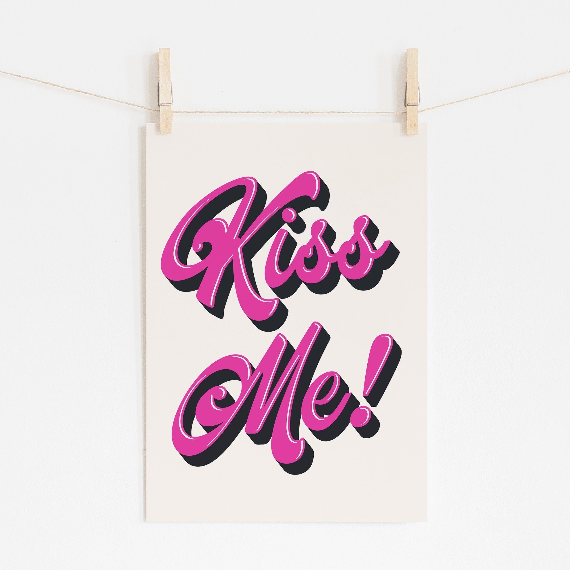
Humor That Includes Rather Than Excludes: Funny hallway prints serve important psychological functions by adding levity to daily routines and creating positive associations with home movement. Effective corridor humor remains inclusive enough to be welcoming to diverse visitors while specific enough to reflect household personality and values.
Wisdom and Reflection Opportunities: Thoughtful quotes that offer gentle wisdom or philosophical reflection can transform routine hallway passages into moments of contemplation and personal growth. The key lies in choosing messages profound enough to reward repeated consideration without being so complex that they can't be absorbed during normal corridor movement.
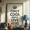
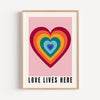
Personal Values and Family Identity: Some of the most meaningful hallway typography directly expresses family values, household rules, or personal philosophies that define domestic life. These messages create sense of identity and belonging while communicating important principles to both residents and guests.
Avoiding Common Message Selection Mistakes
Overly Complex or Lengthy Quotes: Messages that require extended reading or complex interpretation fail in corridor applications where viewing time is limited and cognitive focus is divided between navigation and text processing.
Controversial or Polarizing Content: While personal expression matters, hallway quotes exist in shared social space where divisive messages can create discomfort for visitors or household members with different perspectives.
Temporary Relevance or Trending References: Corridor typography remains visible for extended periods, making messages with short-term relevance or cultural references that might quickly feel dated poor choices for permanent installation.
Negative or Depressing Themes: Daily exposure to pessimistic or discouraging messages can subtly undermine household mood and energy levels, making positive or neutral themes generally more appropriate for corridor applications.
Typography Design Principles for Corridor Applications
Readability in Motion: Font Selection and Sizing
Creating hallway quotes prints that remain legible and impactful during normal corridor movement requires understanding how typography performs under dynamic viewing conditions.
Sans-Serif Clarity for Movement-Based Reading: Clean, simple sans-serif fonts typically work better in corridor applications than decorative or serif typefaces because they remain legible during rapid viewing and under challenging lighting conditions common in hallway environments.
Size Calculations for Corridor Distances: Typography sizing must accommodate typical viewing distances in corridor applications – usually 3-6 feet from wall surfaces. Letters should be large enough to remain readable during normal walking speed but not so large that messages can't be consumed in brief viewing periods.
Weight and Contrast for Visibility: Font weight and background contrast become more critical in corridor applications because text must compete with movement, varying lighting, and divided attention. Bold or semi-bold weights often work better than light fonts, while high contrast between text and background ensures visibility under challenging conditions.
Letter and Word Spacing for Rapid Comprehension: Appropriate spacing between letters and words becomes more important in corridor applications where reading happens quickly and often in peripheral vision. Generous spacing improves readability while cramped typography can become illegible during movement-based viewing.
Color Psychology in Text-Based Hallway Art
High Contrast for Immediate Visibility: Corridor typography must remain visible under diverse lighting conditions and during rapid viewing. High contrast combinations – dark text on light backgrounds or light text on dark grounds – ensure messages remain readable throughout different times of day and lighting scenarios.
Color Temperature and Mood Enhancement: The psychological impact of typography colors becomes more significant in corridor applications because messages are encountered frequently throughout daily routines. Warm colors can provide energy and encouragement while cooler tones offer calm and reflection.
Integration with Existing Color Schemes: Hallway quotes must coordinate with visible colors from adjacent rooms while maintaining sufficient contrast for readability. This often requires careful balance between aesthetic harmony and functional visibility requirements.
Cultural Color Associations in Message Context: Different colors carry cultural meanings that can either support or contradict message content. Understanding these associations ensures typography color choices enhance rather than undermine intended message impact.

Style Variations: From Modern Minimalism to Vintage Charm
Contemporary Typography Approaches
Modern hallway typography design embraces clean lines, sophisticated color relationships, and systematic approaches that coordinate well with contemporary interior design while maintaining message clarity and impact.
Minimalist Typography Design: Clean, simple approaches that emphasize message content over decorative elements work well in contemporary corridor applications. This style prioritizes readability and impact while coordinating easily with modern interior design themes.
Geometric and Systematic Layouts: Structured approaches to typography layout create sophisticated appearances that complement contemporary architecture while ensuring messages remain clearly organized and immediately comprehensible.
Monochromatic and Neutral Color Applications: Single-color approaches or neutral palettes can provide sophisticated corridor typography that coordinates with diverse interior color schemes while maintaining focus on message content rather than decorative color impact.
Integration with Modern Interior Elements: Contemporary hallway typography often works best when coordinated with existing modern fixtures, furniture, and architectural details rather than competing with contemporary design themes.
Traditional and Classic Typography Styles
Serif Typography for Formal Applications: Traditional serif fonts can provide elegance and cultural sophistication appropriate for formal entrance halls or traditional home environments, though they require careful sizing and contrast management for corridor readability.
Classical Layout Principles: Traditional typography approaches that emphasize symmetry, proportion, and classical spacing relationships can create sophisticated corridor art that honors historical design principles while maintaining contemporary functionality.
Rich Color Palettes and Traditional Materials: Deeper, more complex color relationships can provide traditional typography installations with appropriate gravitas and cultural sophistication for formal corridor applications.
Integration with Period Architecture: Traditional typography styles often work best when carefully coordinated with existing architectural elements like crown molding, wainscoting, or other period details that support classical design themes.
Eclectic and Creative Typography Applications
Mixed Font and Style Approaches: Creative combinations of different typography styles can create dynamic corridor installations that reflect household creativity and personality while maintaining overall visual coherence through careful planning and coordination.
Artistic and Decorative Typography: More elaborate typographic treatments can provide corridor art that functions both as textual communication and visual decoration, creating multi-layered installations that reward both reading and visual appreciation.
Cultural and Historical Typography References: Specialized typography approaches that reference specific cultural traditions, historical periods, or artistic movements can create sophisticated corridor installations for households with particular cultural interests or educational backgrounds.
Experimental and Contemporary Typography Trends: Cutting-edge typography approaches that incorporate current design trends can create corridor installations that feel contemporary and culturally current while maintaining message clarity and long-term appeal.
Installation Strategies for Maximum Impact
Height and Positioning for Optimal Reading
Successful hallway typography installation requires understanding how text positioning affects readability during normal corridor movement and daily household activities.
Eye Level Optimization for Movement-Based Reading: Typography positioning must accommodate typical sight lines during corridor movement, which differ from stationary reading positions. Text positioned 54-60 inches from floor level often works well for average adult height while remaining accessible for diverse household members.
Sight Line Analysis for Corridor Approaches: Consider how typography appears when approaching from different directions and distances. Messages should remain readable from corridor approaches while providing appropriate impact when viewed from optimal positions.
Multiple Viewing Distance Accommodation: Hallway typography must work effectively both for close viewing during passage and longer-distance viewing from corridor ends. This often requires careful balance between sizing that supports both viewing conditions.
Integration with Existing Architectural Elements: Typography positioning should coordinate with door frames, lighting fixtures, and other architectural details rather than competing with existing corridor elements for visual attention.
Lighting Considerations for Typography Visibility
Natural Light Integration and Management: Available natural light in corridor applications varies dramatically throughout day and seasonal cycles. Typography installation must ensure readability under diverse natural lighting conditions while avoiding glare problems that might obscure messages.
Artificial Lighting Coordination: Most corridor typography functions primarily under artificial lighting, requiring coordination with existing fixture placement and consideration of shadow patterns that might affect message visibility throughout different times of day.
Enhancement Lighting for Typography Impact: Specialized lighting solutions can dramatically improve typography visibility and impact in challenging corridor conditions. Picture lighting, wall washing, or accent illumination can ensure messages remain visible and attractive under all conditions.
Color Temperature Impact on Typography Appearance: Lighting color temperature significantly affects how typography colors appear and how comfortable reading experiences feel. Understanding existing corridor lighting characteristics helps ensure typography colors work effectively under actual viewing conditions.
Grouping and Arrangement Strategies
Single Statement vs. Multiple Message Approaches: Decide whether corridor typography will feature single powerful messages or multiple coordinated quotes that create comprehensive textual experiences throughout corridor spaces.
Spacing and Relationship Planning: When using multiple typographic elements, maintain consistent spacing relationships that create visual rhythm and flow rather than random placement that appears accidental or unprofessional.
Size Relationship Coordination: Multiple typography pieces should relate harmoniously through coordinated sizing that creates visual hierarchy and flow rather than competing for attention through inappropriate scale relationships.
Thematic and Content Coordination: Multiple hallway quotes should coordinate thematically and tonally to create coherent overall messages rather than conflicting or contradictory content that undermines overall impact effectiveness.

Room-Specific Applications and Considerations
Entrance Halls: First Impression Typography
Typography in entrance areas carries special responsibility for creating welcoming first impressions while establishing household character and values for visiting guests.
Welcome Messages and Hospitality Communication: Entrance typography can explicitly communicate welcome and hospitality while establishing household values and personality for guests. Messages should balance personal expression with inclusive welcome that makes diverse visitors feel comfortable.
Cultural and Sophistication Signaling: Entry hall typography immediately communicates cultural values, educational background, and aesthetic sophistication that influences how guests perceive both household and hosts throughout visit duration.
Seasonal and Occasion Adaptability: Consider whether entrance typography will remain constant or adapt for seasonal celebrations, special occasions, or changing household circumstances that might require message modifications.
Scale Appropriate for Entry Impact: Entrance hall typography often works best at larger scales that create appropriate impact for first impression contexts while remaining readable and welcoming rather than overwhelming or intimidating.
Long Corridors: Creating Textual Journeys
Extended corridor spaces provide opportunities for comprehensive typography installations that create textual narratives or thematic journeys throughout passage experiences.
Progressive Message Development: Long corridors can accommodate multiple messages that build upon each other, creating textual stories or thematic development that unfolds during passage through corridor space.
Rhythm and Repetition in Extended Spaces: Typography rhythm becomes important in long corridor applications where consistent spacing, sizing, or thematic development creates pleasing visual and conceptual flow throughout extended passage experiences.
Focal Point and Supporting Element Balance: Extended corridor typography benefits from clear focal points supported by secondary messages that create visual hierarchy and prevent overwhelming textual density that might reduce individual message impact.
Maintenance and Update Planning: Long corridor typography installations require planning for cleaning, updating, and potential modification over time, particularly important given extended visibility and multiple installation points.
Narrow Hallways: Maximizing Impact in Limited Space
Confined corridor spaces present unique challenges for typography installation while offering opportunities for intimate, impactful textual experiences.
Vertical Emphasis for Spatial Enhancement: In narrow corridors, vertically oriented typography can draw attention upward and create psychological spaciousness while working within width constraints that limit horizontal message development.
Message Concision for Spatial Appropriateness: Narrow spaces often work better with shorter, more concentrated messages that provide impact without overwhelming limited wall space or creating visual chaos in confined environments.
Viewing Distance Optimization: Closer typical viewing distances in narrow corridors allow for smaller typography sizing while requiring careful attention to readability during rapid passage through confined spaces.
Safety and Clearance Considerations: Typography installation in narrow corridors must ensure adequate passage clearance while avoiding protruding elements that might create safety hazards in confined high-traffic areas.
Creating Cohesive Typography Collections
Building Comprehensive Textual Themes
Successful hallway typography often works best when individual messages contribute to larger thematic collections that create comprehensive expressions of household values, humor, or philosophical approaches.
Family Values and Household Philosophy Collections: Typography collections that express core family values or household operating principles can create powerful sense of identity and belonging while communicating important messages to both residents and guests.
Inspirational and Motivational Message Coordination: Coordinated collections of inspirational messages can provide ongoing encouragement and motivation throughout daily household routines while creating sophisticated textual installations that demonstrate thoughtful curation.
Humor and Levity Theme Development: Collections of coordinated humorous messages can create consistently entertaining corridor experiences that add joy and personality to daily home movement while demonstrating household character and values.
Cultural and Educational Typography Collections: Messages that reflect cultural interests, educational values, or intellectual pursuits can create sophisticated corridor installations that communicate household priorities while providing ongoing learning and reflection opportunities.
Maintaining Visual and Conceptual Coherence
Typography Style Consistency: Cohesive typography collections typically benefit from consistent approaches to font selection, sizing, color application, and layout that create visual unity despite message content variety.
Tonal and Content Coordination: Messages within typography collections should coordinate tonally and conceptually to create harmonious overall impressions rather than conflicting themes that undermine collection coherence and impact.
Quality and Production Standards: Consistent production quality, framing approaches, and installation methods ensure typography collections appear professional and intentional rather than accumulated randomly over time without coordinated planning.
Evolution and Growth Planning: Typography collections often grow and evolve over time, requiring initial planning that accommodates future additions while maintaining existing installation coherence and visual organization.

Practical Considerations: Durability and Maintenance
High-Traffic Environment Requirements
Corridor typography installations must accommodate the unique wear patterns, environmental challenges, and maintenance requirements that high-traffic transitional spaces present.
Frame Selection for Corridor Durability: Typography installations in corridor environments require robust framing solutions that protect artwork while withstanding the bumps, touches, and general wear that high-traffic areas experience.
Glass and Protective Coating Considerations: Protective glazing becomes more important for corridor typography because of increased exposure to touching, humidity variations, and cleaning requirements that high-traffic areas demand.
Mounting and Security Systems: Typography installation hardware must provide security appropriate for high-traffic environments while ensuring messages remain properly positioned despite vibration from foot traffic and door operation.
Cleaning and Maintenance Access Planning: Regular cleaning becomes more important for corridor typography due to increased dust exposure and touching. Installation methods should facilitate easy cleaning access while protecting artwork from damage during maintenance activities.
Long-Term Message Relevance
Timeless vs. Contemporary Message Selection: Consider whether typography messages will remain relevant and appealing over extended installation periods or require periodic updating to maintain household relevance and guest appeal.
Personal Growth and Life Change Accommodation: Household values, circumstances, and priorities evolve over time. Typography selection should either accommodate these changes or allow for easy updating without requiring complete corridor redesign.
Seasonal and Occasion Adaptability: Some typography installations benefit from flexibility that allows seasonal updates or special occasion modifications without compromising permanent installation quality or requiring professional reinstallation.
Quality Investment for Longevity: Higher-quality typography installations justify their cost through extended service life and maintained appearance, particularly important given the high visibility and repeated viewing that corridor locations provide.
Budget Planning and Investment Strategy
Understanding Value in Typography Art
Typography-based hallway art represents different investment considerations than other artwork types, requiring adapted approaches to budget planning and quality evaluation.
Message Impact vs. Artistic Investment: Typography value often depends more on message relevance and daily life enhancement than purely artistic considerations, requiring different evaluation criteria than traditional artwork purchases.
Production Quality and Longevity Balance: Balance investment in high-quality production methods and materials with realistic expectations about message longevity and potential updating needs over time.
Custom vs. Ready-Made Typography Options: Consider whether custom typography creation provides sufficient additional value over high-quality ready-made options to justify increased cost and production time.
Installation and Modification Cost Planning: Factor in installation costs, potential lighting modifications, and future updating expenses when evaluating total typography installation investments.
Maximizing Impact Within Budget Constraints
Strategic Focal Point Investment: Concentrate budget on key typography installations in high-impact locations like entrance areas while using less expensive options in secondary corridor locations.
DIY vs. Professional Production Balance: Understand which aspects of typography installation can be handled personally versus requiring professional design, production, or installation services.
Phased Installation Planning: Consider building typography collections gradually over time, allowing budget distribution across multiple periods while ensuring each addition enhances rather than overwhelms existing installations.
Quality vs. Quantity Decision Making: Focus budget on fewer, higher-quality pieces rather than numerous lower-quality installations that might reduce overall corridor impact and satisfaction.

Common Mistakes and Professional Solutions
Why Typography Installations Often Disappoint
Understanding frequent typography installation mistakes helps avoid disappointing results while guiding selection toward proven successful approaches.
Poor Readability and Sizing Decisions: Inadequate attention to typography sizing, font selection, and contrast relationships results in messages that can't be read effectively during normal corridor use.
Inappropriate Message Selection: Choosing quotes that are too complex, controversial, or situationally inappropriate for corridor applications and repeated daily exposure.
Installation Height and Positioning Errors: Positioning typography too high, too low, or in locations where lighting, architectural elements, or traffic patterns interfere with message effectiveness.
Lack of Coordination and Planning: Installing typography without considering overall corridor design, existing elements, or long-term satisfaction and maintenance requirements.
Professional Approaches That Guarantee Success
Comprehensive Planning and Site Analysis: Begin with thorough corridor assessment, lighting evaluation, and realistic consideration of household needs before selecting specific messages or typography approaches.
Quality Production and Installation Standards: Invest in appropriate production quality, professional framing, and proper installation methods that ensure long-term satisfaction and appearance maintenance.
Message Testing and Validation: Consider living with potential messages temporarily before permanent installation to ensure content remains appealing and relevant through repeated exposure.
Professional Design and Layout Services: When appropriate, invest in professional typography design services that ensure optimal readability, visual impact, and coordinate integration with corridor environments.
Conclusion: Words That Transform Corridors Into Character
Typography and quotes in hallway applications represent one of the most personal and impactful forms of interior art available to homeowners seeking to infuse personality, wisdom, and joy into their daily domestic experience. Unlike other art forms that communicate through color, form, or image, corridor typography speaks directly and immediately, transforming mundane transitions into opportunities for inspiration, reflection, laughter, and connection with the values that define meaningful home life.
The principles outlined in this comprehensive guide – from understanding movement-based reading psychology through message selection strategies to professional installation techniques – provide the foundation for creating typography installations that genuinely enhance daily life rather than simply filling empty corridor walls. The most successful hallway quotes prints become integral parts of household rhythm, providing daily touchstones of encouragement, humor, or wisdom that accumulate into significant quality-of-life improvements over time.
Remember that the most impactful corridor typography reflects authentic household values and genuine personal expression rather than following trends or attempting to impress visitors through sophisticated but irrelevant messages. The words you choose to live with daily should resonate deeply with your family's actual experience while remaining welcoming to the diverse friends and visitors who will encounter these messages during their time in your home.
Typography installation in corridor environments requires balancing immediate visual impact with long-term message relevance, personal expression with inclusive welcome, and aesthetic sophistication with practical functionality. When these elements align successfully, corridor typography transforms overlooked transitional spaces into some of the most meaningful and frequently appreciated areas of entire homes.
Your hallways are waiting to speak – to declare your values, share your humor, offer daily inspiration, and create welcoming messages that transform every passage through your home into an opportunity for positive connection with the words that matter most to your household. The conversation between your family and your corridor art begins with selecting the first message that truly represents who you are and what you value most about the experience of home.
Ready to add personality and inspiration to your corridors with carefully selected typography? Explore our hallway quotes prints collection and discover messages that will transform your transitional spaces into daily sources of joy, wisdom, and authentic self-expression.
About the Author: The TimmyLoves Art team specializes in typography-based interior design, combining expertise in message psychology, movement-based reading principles, and corridor-specific installation techniques. Our understanding of how textual art functions in transitional spaces ensures every typography installation enhances daily home life while reflecting authentic household values.
Related Articles:


