10 Stunning Colourful Kitchen Prints to Brighten Your Space
- by Timmy LovesArt
Colourful Kitchen Prints: The Complete Guide to Vibrant Kitchen Wall Art That Actually Works in 2025
Here's the thing about kitchens: they're supposed to be the heart of your home, but most of them end up looking like sterile operating rooms. White cabinets, white walls, white everything. Safe? Yes. Inspiring? Not even close.
That's exactly why colourful kitchen prints are having such a massive moment right now. After years of playing it safe with beige and gray, homeowners are finally embracing the fact that the room where you cook, eat, and gather should actually spark joy.
And honestly, it's about time.
Why 2025 Is the Year of Bold Kitchen Color
Let's talk about what's really happening in kitchen design right now. That stark, all-white kitchen trend that dominated Instagram for years? It's officially over. Designers are embracing more color — think moody hues like rich red and deep blue, or bright colors like soft pink and sage green.
The shift isn't just aesthetic - it's psychological. We're entering a romance era in interior design. More ornate touches and romantic details are emerging, with organic shapes, nature-inspired motifs, and delicate intricacies creating special moments in design.
Colourful kitchen prints fit perfectly into this movement because they're the easiest way to inject personality and warmth into a space without committing to a full renovation. You can transform your entire kitchen vibe with the right wall art, and change it again next season if you want to.

The Science Behind Why Colorful Art Makes Kitchens Better
There's actual research behind why colourful kitchen prints work so well. Adding artwork to your home can boost your mood by up to 30%. In a space where you spend significant time daily - cooking breakfast, prepping dinner, cleaning up - that mood boost adds up.
But here's what most people don't realize: kitchens have unique psychological requirements. They need to feel energizing enough for morning coffee runs, calming enough for evening wind-downs, and social enough for impromptu gatherings with friends.
Colourful prints help achieve this balance. Bright, vibrant pieces energize the space during busy cooking times. Warmer, more muted colorful pieces create cozy atmospheres for relaxed meals. And interesting, conversation-worthy art makes guests feel welcome and gives everyone something to talk about while you're all crowded around the island.
What's Actually Trending in Vibrant Kitchen Wall Art
Bold abstract designs are everywhere: Think oversized pieces with vibrant colors and geometric shapes that create focal points. These work especially well in modern kitchens because they complement sleek lines while adding the personality that minimalism often lacks.
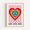
Nature-inspired bright prints: Botanical illustrations in unexpected color palettes - think tropical leaves in electric blues, or citrus fruits in neon brights. It's the biophilic design trend meets maximalist color theory.
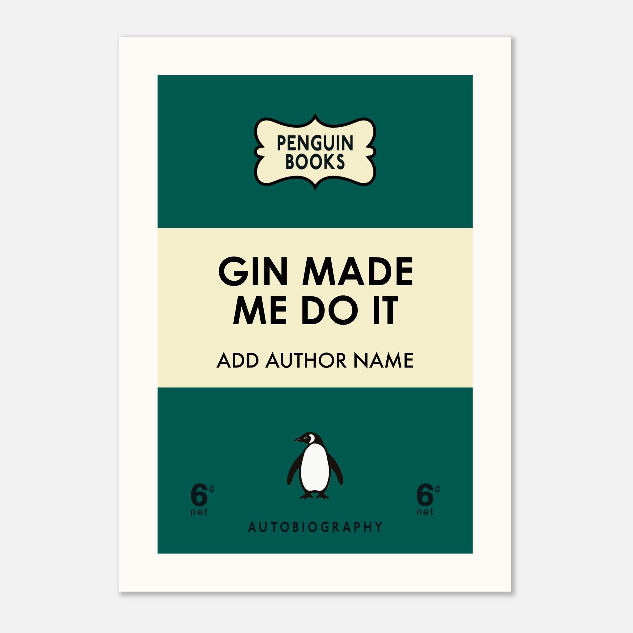
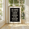
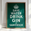
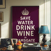
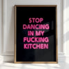
Typography with attitude: Gone are the generic "Eat, Pray, Love" prints. 2025's kitchen typography is bold, cheeky, and personal. "The kitchen is for dancing" or "Save water, drink champagne" - quotes that actually reflect how you live.
Floral wallcovering energy in print form: Taking inspiration from the dramatic floral wallpapers trending in high-end kitchen design, but in manageable print format. Think oversized flower illustrations in unexpected color combinations.
Food and drink art with personality: Not your grandmother's fruit bowl paintings. Modern food illustration with vibrant, stylized approaches. Think watercolor cocktails, geometric vegetables, or abstract interpretations of your favorite dishes.
Vintage-inspired pieces with fresh twists: Taking classic food advertising or vintage kitchen imagery and updating it with contemporary color palettes and modern printing techniques.

Smart Color Psychology for Kitchen Spaces
Energizing colors for morning motivation: Bright yellows, warm oranges, and fresh greens work brilliantly in breakfast areas. They literally wake up your brain and make early mornings feel less brutal.
Social colors for entertaining spaces: Warm reds, rich oranges, and golden yellows create inviting atmospheres that make people want to linger. Perfect near kitchen islands or dining nooks.
Calming colors for evening wind-down: Deeper blues, sage greens, and warm purples help transition your kitchen from day mode to evening mode. Great for pieces you'll see during dinner prep and cleanup.
Appetite-enhancing combinations: Certain color combinations actually make food look more appealing. Warm reds with golden yellows, deep greens with creamy whites, or rich purples with bright oranges can make your kitchen feel more delicious.
Space-enhancing tricks: Lighter, brighter colors can make small kitchens feel more spacious. Cooler colors (blues and greens) can make narrow kitchens feel wider. Warmer colors (reds and oranges) can make large kitchens feel cozier.
Choosing Colourful Prints That Actually Work
Consider your existing palette: Your colorful prints should either complement your current kitchen colors or create intentional contrast. If you have all-white cabinets, you can go bold. If you already have colored cabinets, choose prints that play well with those tones.
Think about natural light: Kitchens with lots of natural light can handle deeper, richer colors. Darker kitchens need brighter, more vibrant pieces to avoid feeling cave-like.
Scale for impact: One large colorful print often works better than several small ones in kitchens. The space is usually busy with appliances, utensils, and food prep items - you need art that can hold its own.
Viewing angles matter: Kitchen art gets seen from multiple directions as you move around cooking. Choose pieces that work from different angles, not just straight-on.
Durability is key: Kitchens are tough environments. Steam, splatter, heat, and humidity all take their toll. Choose prints with proper protection - UV-resistant inks, moisture-resistant papers, and quality framing.

Strategic Placement for Maximum Impact
Above the sink: This wall gets looked at constantly while doing dishes. Perfect spot for something cheerful and energizing. Bright florals or uplifting typography work beautifully here.
Gallery walls in breakfast nooks: Casual eating areas can handle more playful, eclectic arrangements. Mix different sizes and styles of colorful prints for a collected-over-time feel.
Statement walls behind islands: If your island faces the main living area, the wall behind it is prime real estate for bold, large-scale colorful art that guests will see and admire.
Coffee station decoration: Create a dedicated coffee corner with colorful prints that celebrate your morning ritual. Vintage coffee advertisements in fresh colors, or modern typography about coffee culture.
Pantry personality: Open pantries or butler's pantries are perfect spots to go wild with color and pattern. It's contained space where you can experiment without overwhelming the main kitchen.
Backsplash integration: Some people incorporate colorful prints into their backsplash design - either through printed tiles or by placing art in backsplash areas (though this requires careful moisture protection).
Style Combinations That Actually Work
Modern minimalist meets colorful maximalism: Clean-lined kitchens with bold, colorful abstract prints. The contrast creates visual interest while maintaining sophistication.
Farmhouse charm with contemporary color: Traditional kitchen elements paired with vibrant, modern botanical prints or updated vintage food illustrations.
Industrial kitchens with playful pops: Raw materials like exposed brick or metal paired with bright, whimsical prints that soften the hard edges.
Traditional elegance with unexpected brights: Classic kitchen designs elevated with sophisticated but colorful art - maybe botanical illustrations in jewel tones or elegant typography in vibrant colors.
Eclectic maximalism: Mix different colorful print styles together - abstract pieces with botanical prints with typography. The key is finding a unifying element like color palette or frame style.
Budget-Smart Approaches to Colorful Kitchen Art
Digital download strategy: Many Etsy artists offer colorful kitchen prints as downloadable files for £3-10. Print them yourself at a good photo shop and frame them for under £30 total.
Seasonal rotation system: Buy several different colorful prints and swap them out seasonally. Summer citrus prints, autumn harvest themes, winter comfort colors, spring botanical explosions.
DIY color addition: Take black and white prints and add color yourself with watercolor paints or colored pencils. Personal, unique, and budget-friendly.
Photography projects: Take your own colorful food photos and turn them into kitchen art. Style beautiful ingredients, prep scenes, or finished dishes in great lighting.
Local artist support: Commission local artists to create custom colorful pieces for your kitchen. Often more affordable than you'd expect and completely unique.
Template customization: Buy customizable print templates and change the colors to match your kitchen perfectly.

Common Mistakes That Kill the Colorful Kitchen Vibe
Too many competing colors: More isn't always better. Choose 2-3 main colors and stick to them rather than creating rainbow chaos.
Ignoring your lighting: Colors look completely different under warm versus cool lighting. Test your prints in your actual kitchen lighting before committing.
Wrong proportions: Tiny colorful prints in big kitchens look insignificant. Massive prints in tiny kitchens feel overwhelming. Scale matters.
Fighting with appliances: Your colorful art shouldn't compete with colorful appliances or backsplashes. Either go neutral elsewhere or choose colors that complement your existing colorful elements.
Poor quality printing: Colorful prints need excellent printing to look professional. Cheap printing makes even beautiful designs look amateur.
Forgetting the practical stuff: Kitchens generate steam, grease particles, and temperature changes. Unprotected prints will fade, warp, or get damaged quickly.
Maintenance and Longevity Tips
Proper framing is essential: UV-protective glass, acid-free matting, and sealed backing protect colorful prints from kitchen hazards.
Strategic placement: Keep prints away from direct steam sources, stove splatters, and high-moisture areas unless they're specifically protected.
Regular cleaning routine: Dust frames monthly and check for any moisture damage or fading. Prevention is easier than replacement.
Quality printing investment: Better inks and papers last longer and maintain their vibrancy despite kitchen conditions.
Backup plan: Keep digital copies of your favorite pieces so you can reprint if needed. Colors in kitchens do fade over time.

Creating Cohesive Colorful Collections
Theme consistency: Choose colorful prints around a unifying theme - botanical illustrations, food art, vintage advertisements, or abstract geometrics.
Color story approach: Pick 3-4 colors and use them consistently across different print styles. Maybe coral, sage green, and cream in both typography and botanical pieces.
Frame coordination: Use similar frame styles even if print styles vary. Consistent framing makes eclectic collections feel intentional rather than chaotic.
Size rhythm: Create visual rhythm with purposeful size variation. Maybe one large piece with two smaller pieces, repeated in different areas.
Balance consideration: Mix busy patterns with simpler designs, bold colors with softer tones, detailed illustrations with clean typography.
Seasonal Updates That Keep Things Fresh
Spring explosion: Bright botanicals, fresh greens, and floral illustrations that celebrate renewal and growth.
Summer vibrancy: Citrus themes, tropical colors, fresh fruit illustrations, and bright, energizing pieces.
Autumn warmth: Harvest themes, warm oranges and deep reds, cozy food illustrations, and comfort-focused pieces.
Winter sophistication: Deeper colors, elegant compositions, maybe some festive elements without going full Christmas decoration.
Rotation systems: Use picture ledges or easy-change hanging systems so you can swap seasonal pieces without rehanging everything.

The Psychology of Kitchen Color Choices
Morning energy: Bright, warm colors help combat morning grogginess and create positive start-of-day associations.
Social warmth: Reds, oranges, and warm yellows make spaces feel more inviting and encourage gathering and conversation.
Appetite appeal: Certain colors actually enhance appetite and make food look more delicious. Warm colors especially.
Stress reduction: While bright colors energize, having some calmer colorful elements helps balance high-energy kitchen activities.
Personal expression: Colorful art lets your kitchen reflect your personality rather than looking like a showroom.
Making Bold Choices Work Long-Term
Start with what you love: Choose colors that genuinely make you happy, not just what's trendy. You'll live with these daily.
Consider resale carefully: If you're planning to sell soon, stick to more universally appealing colorful choices rather than highly personal ones.
Test before committing: Live with temporary versions of your colorful prints for a few weeks before investing in expensive framing.
Plan for evolution: Your color preferences might change. Choose systems that allow for easy updates rather than permanent installations.
Quality over quantity: Better to have fewer high-quality colorful pieces that you love than many mediocre ones that clutter the space.

The Bottom Line on Colorful Kitchen Prints
The anti-minimalism movement in kitchen design isn't going anywhere, and colorful prints are leading the charge. They're the perfect way to embrace the trend toward more personality and joy in our homes without committing to major renovations.
The key is being intentional about your choices. Consider your existing colors, think about how you actually use your kitchen, and choose pieces that reflect your genuine style rather than just following trends.
Your kitchen should make you happy every time you walk into it. If white walls and safe neutrals don't spark that joy, it's time to embrace some color on those walls.
Start with one piece you absolutely love. See how it transforms the space and how it makes you feel. Then build from there.
Remember, you're not decorating for a magazine shoot - you're creating a space where you'll cook, eat, and gather with people you care about. That space should feel as vibrant and full of life as the activities that happen there.
So go bold. Choose the colorful print that makes you smile. Your morning coffee routine will thank you.
Key Takeaways:
- 2025 kitchen trends favor bold, vibrant colors over sterile minimalism
- Colorful prints provide mood-boosting benefits and personality without major renovation
- Strategic color psychology helps choose prints that energize, calm, or socialize as needed
- Quality printing and proper framing ensure colorful pieces survive kitchen environments
- The best colorful kitchen prints reflect genuine personal style rather than generic trends
