The Typography and Design Legacy of Penguin Classics
- by Timmy LovesArt
Published by Timmy Loves | 13 min read
In the pantheon of 20th-century design achievements, few objects have achieved the perfect synthesis of functionality, beauty, and cultural significance that defines the Penguin book cover. What began as a practical solution to publishing economics evolved into one of the most influential design systems in modern history, shaping not only how we experience literature but how we understand the relationship between typography, color, and cultural communication. Today, as these iconic covers transition from bookstore shelves to gallery walls, their typographic sophistication and design principles continue influencing contemporary art, graphic design, and interior decoration.
The story of Penguin typography is fundamentally the story of how exceptional design can democratize culture while maintaining aesthetic excellence. From the pioneering work of Edward Young through the revolutionary contributions of Jan Tschichold to the contemporary interpretations that inspire today's penguin classic prints, this design legacy represents nearly a century of typographic innovation that has influenced countless designers while creating some of the most recognizable and beloved book covers in publishing history.
Understanding this typographic heritage isn't merely academic – it directly informs how we approach creating contemporary penguin classics art prints that honor the sophisticated design principles while adapting to modern aesthetic contexts and personal customization needs. Every letterform choice, every color relationship, every spatial decision in our custom pieces draws from this rich foundation of design excellence.

The Foundation: Typography as Cultural Democracy
Edward Young and the Original Vision (1935-1947)
The typography choices that defined early Penguin books weren't arbitrary aesthetic decisions – they represented a revolutionary approach to making serious literature accessible without compromising visual sophistication.
Gill Sans: The Humanist Revolution: Edward Young's decision to use Eric Gill's typeface for Penguin covers marked a crucial moment in design history. Gill Sans combined the clarity and functionality of modernist sans-serif design with humanist proportions and character that made literature feel approachable rather than intimidating. This balance between contemporary efficiency and human warmth became foundational to Penguin's identity.
Systematic Typography for Mass Production: Young developed the first systematic approach to Penguin cover typography, creating templates and specifications that ensured consistency across hundreds of titles while allowing for necessary variation. This systematic thinking influenced not only publishing design but the broader development of corporate identity and design system thinking.
Color-Coded Hierarchy and Information Design: The integration of typography with Penguin's famous color coding system created one of the earliest examples of sophisticated information design. Typography, color, and layout worked together to communicate genre, series affiliation, and cultural positioning – principles that remain relevant for contemporary graphic design across all media.
Democratic Design Philosophy: Young's typographic choices reflected Allen Lane's vision of making quality literature accessible to mass audiences. The typography had to work for both literary classics and contemporary fiction, for educated readers and those discovering serious literature for the first time. This inclusive approach influenced decades of public design and communication.
The Cultural Context of 1930s Typography
Understanding the broader typographic context of Penguin's early years illuminates why certain design choices were so revolutionary and why they continue influencing contemporary design.
Modernist Typography vs. Traditional Publishing: While European modernists like Jan Tschichold were developing radical new approaches to typography, British publishing remained largely conservative. Penguin's early typography bridged these worlds, bringing modernist clarity to traditional literary content in ways that felt contemporary without being alienating.
Commercial Printing Constraints and Creative Solutions: The technical limitations of 1930s commercial printing significantly influenced typographic choices. Young and his collaborators had to create sophisticated designs within severe constraints, leading to elegant solutions that proved typography's power to create beauty within limitations.
Cultural Accessibility and Visual Literacy: Britain in the 1930s had diverse literacy levels and cultural backgrounds. Penguin typography had to communicate effectively across this diversity while gradually educating readers about sophisticated design. This challenge produced typographic solutions that worked immediately while revealing additional subtleties over time.
The Golden Age: Jan Tschichold's Revolutionary Impact (1947-1949)
Bringing European Modernism to Mass Publishing
When Jan Tschichold joined Penguin in 1947, he brought decades of typographic expertise and European modernist principles that would fundamentally transform not only Penguin design but British publishing generally.
The Penguin Composition Rules: Tschichold's detailed specifications for typography, spacing, and layout created the most comprehensive design system in publishing history. These rules covered everything from letter spacing and line spacing to the precise positioning of text elements, creating consistency that allowed for creative expression within systematic constraints.
Classical Proportions in Modern Context: Tschichold's deep knowledge of classical typography enabled him to apply historical proportional systems to contemporary design challenges. His Penguin work demonstrated how ancient wisdom about letterform relationships could enhance modern communication rather than constraining it.
International Typography Standards: Tschichold's background in German, Swiss, and international typography brought global standards to British publishing. His Penguin work influenced not only British design but helped establish international approaches to book design that continue influencing publishers worldwide.
Typography as Fine Art: Under Tschichold's influence, Penguin covers became increasingly sophisticated artworks that demonstrated typography's potential as a fine art medium. This elevation of commercial design influenced broader cultural attitudes about the artistic value of graphic design and commercial art.

Technical Innovation and Artistic Excellence
Tschichold's Penguin work represented the perfect synthesis of technical mastery and artistic vision, creating designs that were both functionally superior and aesthetically exceptional.
Micro-Typography and Detail Refinement: Tschichold's obsession with typographic detail – letter spacing, word spacing, line spacing, and overall text texture – created covers that felt more refined and sophisticated than previous publishing design. This attention to micro-typography influenced generations of designers and established quality standards that continue affecting contemporary design.
Asymmetrical Layout and Dynamic Balance: While maintaining Penguin's systematic approach, Tschichold introduced asymmetrical layouts and dynamic compositions that created more visual interest and contemporary appeal. These innovations demonstrated how systematic design could accommodate creative expression and visual experimentation.
Integration of Image and Type: Tschichold pioneered sophisticated integration of photographic and illustrative elements with typography, creating covers where all visual elements worked together harmoniously rather than competing for attention. This holistic approach influenced not only book design but broader graphic design practice.
Color and Typography Relationships: Tschichold's deep understanding of how typography interacts with color led to subtle refinements in Penguin's color system that enhanced both legibility and aesthetic appeal. These color-typography relationships became models for contemporary graphic design across multiple industries.
Evolution and Expansion: Post-Tschichold Development (1950s-1970s)
Germano Facetti and the Modernization of Penguin Design
When Germano Facetti became Art Director in 1961, he brought Italian design sophistication and contemporary cultural awareness that adapted Penguin's typographic heritage for changing times.
Photographic Integration and Typography: Facetti pioneered the integration of photography with Penguin's typographic system, creating covers that felt contemporary and culturally relevant while maintaining the systematic design principles established by earlier designers. This integration influenced not only book design but magazine design, advertising, and contemporary graphic design.
International Design Collaboration: Facetti's global perspective brought international designers and artists into Penguin's design process, creating covers that reflected diverse cultural approaches while maintaining typographic consistency and brand recognition.
Pop Culture Integration: The 1960s required design that could appeal to younger, more culturally diverse audiences while maintaining intellectual credibility. Facetti's typographic choices bridged traditional literary culture with contemporary pop culture sensibilities.
Systematic Flexibility: Facetti developed ways to maintain Penguin's systematic approach while allowing for greater creative expression and contemporary relevance. This balance between consistency and innovation became a model for how design systems could evolve without losing their essential character.
Derek Birdsall and Contemporary Sophistication
Derek Birdsall's contributions to Penguin design in the 1960s and 1970s brought additional sophistication and contemporary awareness that further developed Penguin's typographic heritage.
Grid Systems and Modernist Organization: Birdsall applied sophisticated grid systems to Penguin design, creating more complex and visually interesting layouts while maintaining the clarity and functionality that defined the brand.
Experimental Typography within Traditional Frameworks: Birdsall explored how experimental and contemporary typography could work within Penguin's established systems, pushing creative boundaries while respecting historical achievements.
Educational and Academic Series Design: Birdsall's work on educational and academic Penguin series required typography that could handle complex information while maintaining aesthetic appeal. This work influenced educational design and academic publishing broadly.

Typography Analysis: What Makes Penguin Lettering So Effective
Letterform Selection and Character
The specific typefaces chosen for different Penguin series weren't arbitrary – they reflected deep understanding of how letterforms communicate meaning beyond mere legibility.
Sans-Serif Authority and Accessibility: The use of sans-serif typefaces like Gill Sans created typography that felt both authoritative and approachable. These letterforms communicated seriousness without intimidation, sophistication without pretension – perfect for literature that aimed to be both intellectually substantial and broadly accessible.
Serif Typography for Classical Content: When serif typefaces appeared in Penguin design, they were chosen for their ability to communicate historical continuity, scholarly authority, and connection to literary tradition. These choices demonstrated sophisticated understanding of how typography creates cultural associations.
Weight and Proportion Psychology: The specific weights and proportions used in Penguin typography created psychological impressions of quality, permanence, and cultural significance. Bold enough to command attention, refined enough to suggest sophistication, these typographic choices influenced how readers perceived both individual titles and literature generally.
International Adaptability: Penguin's typographic system had to work across different languages, alphabets, and cultural contexts as the brand expanded globally. The underlying principles proved flexible enough to accommodate diverse linguistic needs while maintaining brand recognition.
Hierarchy and Information Organization
Penguin covers consistently demonstrate masterful typographic hierarchy that guides readers' attention while creating visually satisfying compositions.
Title Prominence and Author Integration: The relationship between title typography and author names in Penguin design creates clear information hierarchy while maintaining visual balance. Titles receive appropriate emphasis while author names maintain dignity and prominence.
Publisher Information and Series Identity: The integration of publisher information, series markers, and other publishing details demonstrates how complex information can be organized typographically without creating visual chaos or compromising aesthetic appeal.
Spine Typography and Shelf Presence: Penguin's attention to spine typography ensured books worked both individually and as parts of collections. This consideration influenced how typography creates both individual identity and collective coherence.
Scale Relationships and Optical Correction: The size relationships between different typographic elements in Penguin design demonstrate sophisticated understanding of optical correction and visual perception – making adjustments that ensure typography appears balanced and proportional rather than merely mathematically correct.
Color and Typography Integration: The Penguin System
Systematic Color Application in Typography
Penguin's integration of color and typography created one of the most sophisticated and influential design systems in modern commercial design.
Genre-Based Color Coding: The famous color coding system – orange for fiction, blue for biography, green for crime – required typography that worked effectively across all color applications while maintaining consistent brand identity and hierarchical clarity.
Typography Color Relationships: The interaction between typographic elements and background colors in Penguin design demonstrates sophisticated understanding of color theory, contrast relationships, and legibility requirements across diverse lighting conditions and reproduction methods.
Cultural Color Associations: Different colors carry different cultural meanings and psychological associations. Penguin's typography had to work with these color meanings to reinforce appropriate genre associations while maintaining cross-cultural effectiveness.
Technical Color Reproduction: The printing technologies available during different periods of Penguin publishing significantly influenced both color choices and typographic design decisions. Understanding these technical constraints illuminates why certain design solutions were chosen and why they proved so enduringly effective.
Evolution of Color-Typography Relationships
As printing technology improved and cultural color associations evolved, Penguin's integration of color and typography adapted while maintaining systematic coherence.
Expanded Color Palettes: Later Penguin series introduced additional colors that required typography flexible enough to work with expanded palettes while maintaining brand consistency and hierarchical clarity.
Contemporary Color Trends: Penguin design had to balance systematic consistency with contemporary color trends, creating solutions that felt current while honoring established brand associations.
International Color Considerations: Global expansion required understanding how different cultures interpret color-typography relationships, leading to subtle adaptations that maintained brand identity while respecting local sensitivities.

Influence on Contemporary Graphic Design
Design Education and Professional Practice
Penguin's typographic achievements became foundational case studies in design education worldwide, teaching principles that extend far beyond book publishing.
Design System Thinking: Penguin's systematic approach to typography influenced how designers approach brand identity, corporate communication, and complex design challenges across industries. The idea that systematic thinking enhances rather than constrains creativity became a cornerstone of modern design education.
Typography as Brand Identity: Penguin demonstrated how consistent typographic choices could create strong brand recognition while allowing for creative expression and contemporary relevance. This approach influenced corporate identity design across industries.
Integration of Multiple Design Elements: Penguin's sophisticated integration of typography, color, imagery, and layout provided models for holistic design thinking that considers all visual elements as part of unified systems.
Cultural Communication Through Design: Penguin showed how design choices could communicate cultural values, educational philosophies, and social positions – influencing how designers understand their role in broader cultural communication.
Contemporary Applications and Adaptations
Modern designers continue drawing inspiration from Penguin's typographic heritage while adapting these principles for contemporary media and communication challenges.
Digital Typography and Penguin Principles: The typographic principles developed for Penguin publishing translate effectively to digital media, web design, and contemporary communication platforms, demonstrating the enduring relevance of fundamental design excellence.
Brand Identity and Systematic Design: Contemporary corporate identity programs often reference Penguin's systematic approach to typography, color, and layout as models for creating coherent brand experiences across multiple touchpoints and media.
Editorial Design Evolution: Magazine design, newspaper typography, and contemporary publishing continue drawing inspiration from Penguin's innovations in hierarchy, layout, and the integration of image and text.
From Book Cover to Wall Art: Typography at Scale
Scaling Typography for Contemporary Art Applications
The transition from book cover to wall art presents unique challenges and opportunities for Penguin's typographic heritage.
Scale Independence and Typographic Quality: Great typography works across different scales, and Penguin covers demonstrate this principle beautifully. The clear letterforms, balanced proportions, and sophisticated spacing that worked at book size remain effective when enlarged for wall art applications.
Detail Preservation and Enhancement: Enlarging Penguin typography for wall art reveals subtleties and refinements that weren't visible at original scale, allowing viewers to appreciate the sophisticated craftsmanship and attention to detail that defines exceptional typographic design.
Contemporary Viewing Conditions: Wall art is viewed under different conditions than book covers – different distances, lighting situations, and duration of observation. Understanding these differences helps inform how Penguin typography translates most effectively to contemporary art applications.
Interior Design Integration: Typography intended for wall art must work within interior design contexts while maintaining its essential character and cultural associations. This requires understanding how typographic choices interact with architectural elements, furniture, and other design elements.
Customization While Maintaining Typographic Integrity
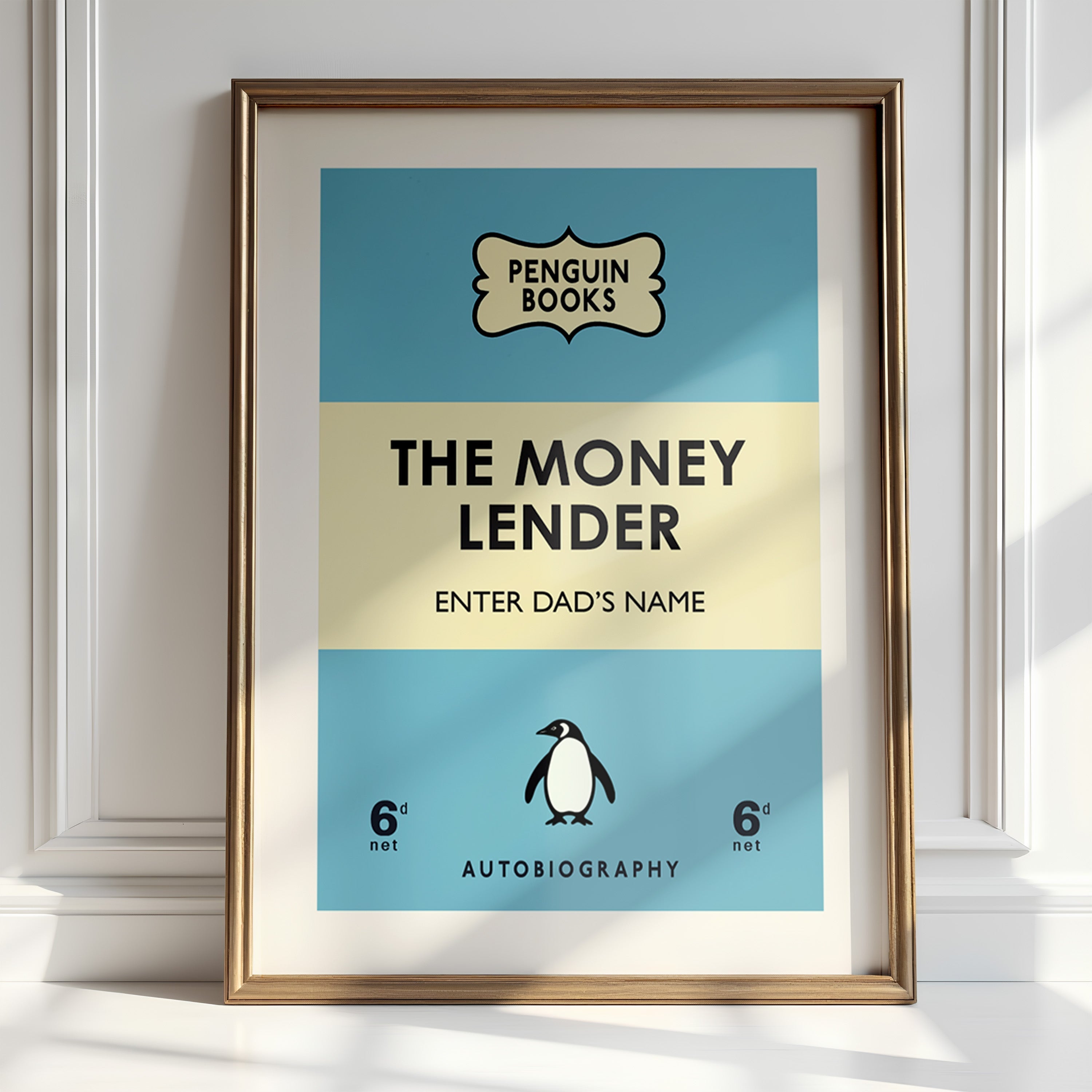
Creating personalised penguin classic prints requires balancing customization desires with respect for the typographic principles that make original designs effective.
Typography Authenticity in Custom Applications: Personal content must be integrated using typography that matches the weight, style, and character of authentic Penguin design. This attention to typographic detail ensures custom pieces feel like discovered rather than created artifacts.
Hierarchical Integration of Personal Content: Adding personal names, dates, or messages requires understanding the hierarchical principles that make Penguin typography effective, ensuring custom additions enhance rather than disrupt original design relationships.
Cultural Sensitivity in Contemporary Applications: Custom applications must honor both the British publishing heritage of Penguin books and the cultural contexts of contemporary users, creating pieces that feel respectful of tradition while remaining personally meaningful.
Quality Standards for Contemporary Production: Modern printing technology enables typographic quality that meets or exceeds original Penguin production standards, but achieving this quality requires understanding both historical methods and contemporary technical possibilities.

The Future of Penguin Typography in Contemporary Design
Continuing Influence and Evolution
As design technology and cultural contexts continue evolving, Penguin's typographic heritage adapts while maintaining its essential character and influence.
Digital Design Applications: Contemporary digital design continues drawing inspiration from Penguin typography, adapting these principles for websites, applications, and digital communication platforms that require both clarity and cultural sophistication.
Global Design Influence: Penguin's typographic principles influence designers worldwide, creating international approaches to systematic design that honor both local cultural sensitivities and universal design excellence.
Educational and Cultural Applications: Museums, educational institutions, and cultural organizations continue referencing Penguin design as models for communication that combines intellectual sophistication with broad accessibility.
Sustainability and Design Longevity: In an era of increasing environmental consciousness, Penguin's demonstration of timeless design that remains relevant across decades provides models for sustainable design thinking that values longevity over novelty.
Contemporary Challenges and Opportunities
Technology Integration: Contemporary design must accommodate rapidly changing technology while maintaining the timeless qualities that give design enduring value and relevance.
Cultural Diversity and Global Design: Contemporary applications of Penguin principles must work across increasingly diverse cultural contexts while maintaining the universal appeal that made original designs so influential.
Personalization and Mass Customization: Modern technology enables mass customization that requires systematic design thinking capable of accommodating individual preferences while maintaining coherent brand and aesthetic identity.
Environmental and Social Responsibility: Contemporary design must consider environmental impact, social responsibility, and cultural sensitivity in ways that weren't primary concerns during Penguin's formative years.
Conclusion: Typography as Cultural Heritage
The typographic legacy of Penguin Classics represents more than design history – it demonstrates how exceptional typography can democratize culture, elevate commercial communication, and create lasting aesthetic value that transcends its original context. From Edward Young's pioneering systematic approach through Jan Tschichold's masterful synthesis of tradition and innovation to contemporary applications in personalized wall art, this design heritage continues influencing how we understand the relationship between letterforms, cultural communication, and aesthetic excellence.
Understanding this typographic heritage enriches our appreciation for penguin classic prints while informing better design decisions for contemporary applications. The principles that made Penguin typography so effective – systematic thinking, attention to detail, cultural sensitivity, and respect for both tradition and innovation – remain as relevant today as they were during the golden age of British publishing.
As we continue adapting these principles for contemporary needs – whether creating personalised penguin book prints, designing digital interfaces, or developing new approaches to cultural communication – we participate in an ongoing tradition that values both aesthetic excellence and democratic accessibility. The best contemporary interpretations honor this heritage while remaining genuinely useful and beautiful for current contexts and future development.
Your walls deserve typography that connects with this rich tradition of design excellence while expressing contemporary values and personal meaning. Whether celebrating literary heritage, creating sophisticated interior environments, or simply appreciating the intersection of great design and cultural significance, penguin classics art prints offer unique opportunities to live with typography that has shaped how we understand the relationship between beautiful letterforms and meaningful communication.
The story of Penguin typography continues with every contemporary application that honors its principles while adapting for new contexts, new technologies, and new cultural needs. By understanding and appreciating this heritage, we ensure that the democratic ideal of beautiful, functional design remains alive and relevant for future generations who deserve access to the same synthesis of aesthetic excellence and cultural accessibility that has defined Penguin design for nearly a century.
Ready to bring this typographic heritage into your home? Explore our penguin classics art prints collection and discover how nearly a century of design excellence can enhance your space with sophisticated literary art.
About the Author: The TimmyLoves Art team combines extensive research into typography and design history with contemporary printing expertise. Our deep understanding of Penguin's typographic evolution informs every piece we create, ensuring authentic connections between historical design excellence and modern artistic applications.
Related Articles:


