Hallway Wall Prints
- by Timmy LovesArt
Hallway Wall Prints: Complete Guide to Choosing, Arranging & Styling (2025)
Hallway wall prints should be 16x20 to 24x36 inches for standard hallways, hung at 57-60 inches from floor to center. Popular themes include typography quotes, botanical designs, abstract art, and family-oriented phrases. For gallery walls, use 5-9 prints with consistent framing, spaced 2-4 inches apart. Prints cost $10-60 (£7.99-50), with affordable options starting under $15 (£10). Choose portrait orientation for narrow hallways under 48 inches wide.
This comprehensive guide covers everything you need to select, arrange, and style hallway wall prints, including the best themes, placement formulas, gallery wall layouts, seasonal rotation ideas, and budget-friendly shopping strategies for both US and UK homeowners.
Last Updated: October 2025
Table of Contents
- Why Hallway Wall Prints Matter
- Best Print Themes & Styles for Hallways
- Sizing Guide: What Size Prints for Your Hallway
- Gallery Wall Layouts for Hallways
- Placement & Hanging Guidelines
- Seasonal Print Rotation Ideas
- Personalization & Custom Options
- Budget Shopping Guide
- Framing & Display Solutions
- FAQ: Hallway Wall Prints
1. Why Hallway Wall Prints Matter
Hallways are among the most underutilized spaces in homes, yet they're high-traffic areas that create lasting first impressions.
The Impact of Hallway Art
First Impressions:
- Entryway hallways are the first thing guests see
- 83% of visitors form impressions within 7 seconds of entering
- Well-decorated hallways signal attention to detail throughout the home
- Sets the tone for the rest of your interior design
Daily Mood Boosters:
- You pass through hallways 15-30 times daily
- Uplifting prints improve mood and reduce stress
- Familiar, meaningful art creates comfort and belonging
- Better than blank walls that feel institutional
Space Optimization:
- Transforms "dead space" into functional decor
- Makes narrow hallways feel intentional, not neglected
- Adds personality without taking floor space
- Cost-effective way to elevate your home
Psychology of Hallway Decor
Transition Zones:
- Hallways are psychological bridges between rooms
- Art here prepares mindset for the next space
- Calming prints before bedrooms aid relaxation
- Energizing prints near entryways welcome guests
Memory & Identity:
- Gallery walls create visual autobiography
- Family-themed prints reinforce home identity
- Personal photos in hallways show what you value
- Visitors remember decorated hallways 3x more than bare ones

2. Best Print Themes & Styles for Hallways
Different themes create different atmospheres. Choose based on your hallway's location and your design goals.
Typography & Quote Prints
Best for: Modern homes, motivational spaces, conversation starters
Popular Themes:
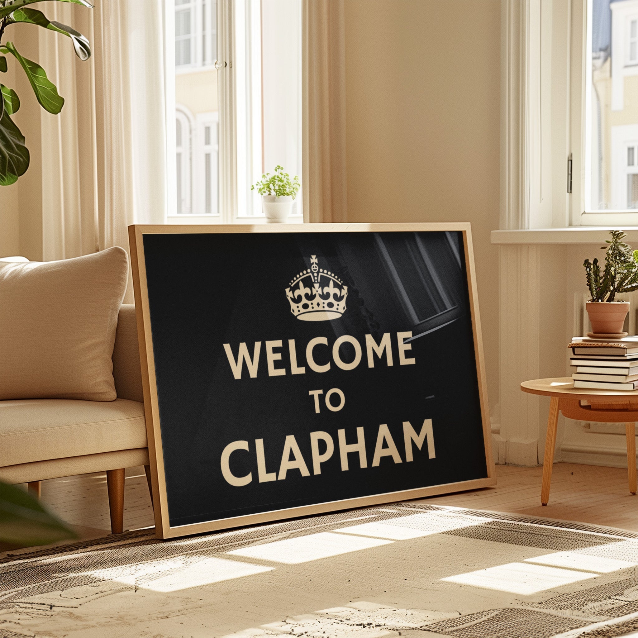
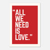
- Welcome messages: "Home Sweet Home," "Welcome to Our Home," "This Must Be The Place"
- Family quotes: "Family Where Life Begins," "Together is Our Favorite Place," "Home is Wherever I'm With You"
- Motivational: "Good Vibes Only," "Live Laugh Love," "Dream Big," "Choose Joy"
- Location-specific: Custom city names, coordinates, family established dates
Why They Work:
- Easy to read while walking
- Personal and meaningful
- Affordable to produce ($10-30 / £7.99-25)
- Work with any color scheme (usually black/white)
- Timeless appeal across design trends
Styling Tips:
- Use bold, simple fonts (avoid script for hallways)
- High contrast: black on white or white on black
- Mix with complementary art (botanical, abstract)
- Limit to 1-2 quote prints per hallway to avoid cliché
Botanical & Nature Prints
Best for: Traditional homes, spa-like atmospheres, bringing life to windowless hallways
Popular Styles:
- Vintage botanical illustrations (ferns, herbs, flowers)
- Modern leaf prints (monstera, palm, eucalyptus)
- Pressed flower designs
- Watercolor florals
- Nature photography (forests, beaches, mountains)
Why They Work:
- Universally appealing and calming
- Work in any room style
- Easy to coordinate colors
- Multiple prints create cohesive sets
- Never go out of style
Styling Tips:
- Group by color palette (all green botanicals, all neutrals)
- Mix vintage with modern for eclectic look
- Frame in natural wood for organic feel
- Create seasonal variations (spring blooms, autumn leaves)
Abstract & Geometric Art
Best for: Contemporary homes, adding color, modern aesthetics
Popular Styles:
- Minimalist line art
- Colorful abstract compositions
- Geometric shapes and patterns
- Mid-century modern designs
- Color block art
Why They Work:
- Adds energy without being literal
- Flexible interpretation fits any mood
- Bold colors brighten dim hallways
- Works well in sets of 3, 5, or 7
- Scales well to different sizes
Styling Tips:
- Pull colors from adjacent rooms
- Mix shapes (circles, rectangles, triangles) for variety
- Keep 60% of prints in neutral tones, 40% in bold colors
- Use black frames to unify diverse abstract pieces

Black & White Photography
Best for: Sophisticated look, timeless style, budget-conscious decorating
Popular Subjects:
- Architectural details
- Nature close-ups (leaves, waves, textures)
- City skylines
- Vintage photographs
- Abstract patterns
Why They Work:
- Easy to mix and match
- Works with literally any wall color
- More affordable than color printing
- Creates gallery-like sophistication
- Won't clash when you redecorate
Styling Tips:
- Vary subject matter within monochrome palette
- Mix photo sizes for visual interest
- Use consistent frame style (all black or all white)
- Add one color accent piece per 5 black/white prints
Family & Home Themes
Best for: Creating warmth, personalization, family-focused homes
Popular Concepts:
- House numbers or street names
- Family name with established date
- "Home" themed prints
- Custom coordinates (wedding location, birthplace)
- Personalized prints with family members' names
Why They Work:
- Deeply personal and meaningful
- Makes house feel like "home"
- Great conversation starters
- Unique to your family
- Perfect for gift-giving
Styling Tips:
- Balance personalized prints (30%) with neutral art (70%)
- Use elegant fonts for sophisticated look
- Frame in premium materials (wood, metal) to elevate
- Update when family changes (new baby, new home)
Vintage & Retro Art
Best for: Eclectic homes, adding character, nostalgic appeal
Popular Styles:
- Vintage travel posters
- Retro advertisements
- Old map prints
- 1950s-1970s inspired graphics
- Vintage botanical or anatomical illustrations
Why They Work:
- Instant character and history
- Conversation pieces
- Works well mixed with modern
- Affordable reproductions widely available
- Trending in farmhouse and eclectic styles
Styling Tips:
- Mix vintage with one modern element
- Use distressed or antique frames
- Group by era (all 1960s, all Victorian)
- Pair with rustic or industrial decor

3. Sizing Guide: What Size Prints for Your Hallway
Choosing the right size prevents your hallway from feeling cluttered or empty.
Measure Your Hallway First
Width Measurement:
- Narrow: 36-42 inches
- Standard: 42-48 inches
- Wide: 48-60 inches
- Extra wide: 60+ inches
Length Measurement:
- Short: 6-10 feet
- Standard: 10-15 feet
- Long: 15-25 feet
- Extra long: 25+ feet
Height Measurement:
- Standard ceiling: 8 feet
- Tall ceiling: 9-10 feet
- Very tall: 10+ feet
Size Recommendations by Hallway Width
Narrow Hallways (36-42 inches):
- Single prints: 16x20 or 18x24 inches maximum
- Gallery wall: 12x16 or 16x20 per piece
- Maximum art width: 24 inches
- Portrait orientation strongly recommended
- Avoid prints wider than 60% of hallway width
Standard Hallways (42-48 inches):
- Single prints: 20x24 to 24x36 inches
- Gallery wall: 16x20 to 20x24 per piece
- Maximum art width: 30 inches
- Portrait or square orientation work well
- Can accommodate 3-5 piece gallery walls
Wide Hallways (48-60 inches):
- Single prints: 24x36 to 30x40 inches
- Gallery wall: 20x24 to 24x30 per piece
- Maximum art width: 40 inches
- Any orientation works
- Perfect for larger gallery walls (7-9 pieces)
Extra Wide Hallways (60+ inches):
- Single prints: 30x40 to 40x60 inches
- Gallery wall: 24x36 per piece
- Maximum art width: 48 inches
- Landscape orientation creates balance
- Can use furniture (console tables) with art above
Size Recommendations by Hallway Length
Short Hallways (6-10 feet):
- Use 1-3 prints maximum
- Larger single prints work well (24x36 inches)
- Avoid overcrowding
- Space prints 40-50 inches apart
Standard Hallways (10-15 feet):
- Use 3-5 prints
- Mix sizes for interest
- Gallery walls work perfectly
- Space 45-60 inches apart for single row
Long Hallways (15-25 feet):
- Use 5-9 prints
- Create rhythm with repetition
- Multiple gallery wall sections possible
- Space 50-60 inches apart
Extra Long Hallways (25+ feet):
- Use 9-15 prints or multiple gallery walls
- Break into sections (every 8-10 feet)
- Vary gallery wall styles to maintain interest
- Consider accent furniture to break up space
The 60% Rule
Critical sizing formula:
- Measure hallway width
- Multiply by 0.60 (60%)
- Result = maximum print width
Examples:
- 40-inch hallway × 0.60 = 24-inch max print width
- 48-inch hallway × 0.60 = 29-inch max print width (use 24x30)
- 60-inch hallway × 0.60 = 36-inch max print width
Following this rule prevents prints from overwhelming the space.
4. Gallery Wall Layouts for Hallways
Gallery walls maximize impact in hallways. Here are proven layouts that work.
Linear Gallery (Single Row)
Best for: Narrow to standard hallways, clean modern look
Layout:
- 3-7 prints in one horizontal line
- All at same height (top edges aligned)
- Equal spacing between prints
Spacing Formula:
- Measure total wall length
- Subtract total width of all prints
- Divide remaining space by (number of prints + 1)
- This gives edge spacing and between-print spacing
Example: 12-foot (144") wall with 5 prints at 16" wide each:
- Total print width: 5 × 16" = 80"
- Remaining space: 144" - 80" = 64"
- Spacing needed: 64" ÷ 6 spaces = 10.6" (use 10-11")
Frame Style: All identical for cohesive look
Grid Gallery (Symmetrical)
Best for: Standard to wide hallways, organized aesthetic
Popular Grids:
- 2×2 (4 prints): Compact, works in short hallways
- 3×2 (6 prints): Rectangular, fits most hallways
- 3×3 (9 prints): Statement wall, needs space
- 4×2 (8 prints): Long hallways only
Key Rules:
- All prints same size
- Tight spacing (2-3 inches between prints)
- Perfect alignment crucial
- Works best with 12x16 or 16x20 inch prints
Planning:
- Cut paper templates
- Tape to wall to visualize
- Measure from center point outward
- Use level for every piece
Salon Style (Asymmetric)
Best for: Wide hallways, eclectic homes, showing personality
Characteristics:
- Mixed sizes (combine 12x16, 16x20, 20x24)
- Varied spacing
- Organic, collected-over-time look
- Mix of orientations (portrait and landscape)
How to Plan:
- Start with largest piece as anchor
- Build outward maintaining balance
- Keep heaviest visual weight low and centered
- Maintain 3-6 inch spacing throughout
Tips:
- Limit to 3 different sizes maximum
- Keep outer edges forming rough rectangle
- Use consistent frame style despite size variety
- Total gallery should not exceed 60% of wall width
Vertical Stack
Best for: Very narrow hallways, end of hallway focal walls
Layout:
- 2-4 prints stacked vertically
- All same size
- Centered on wall
- Tight spacing (2-4 inches)
Height Planning:
- Center entire stack so middle falls at 60 inches
- For 3 prints (16x20):
- Total height with spacing: 60" + 4" + 4" = 68"
- Top of stack: 60" + 34" = 94" from floor
- Bottom of stack: 60" - 34" = 26" from floor
Best Sizes: 16x20, 18x24, or 20x24 inches
Themed Groupings
Best for: Long hallways, storytelling, family galleries
Concept:
- Divide long hallway into 2-3 sections
- Each section has different theme
- Maintain visual connection through framing
Example Sections:
- Section 1 (near entry): Welcome quotes and botanical
- Section 2 (middle): Family photos and milestones
- Section 3 (near bedrooms): Calm nature scenes
Spacing Between Sections: 4-6 feet minimum

5. Placement & Hanging Guidelines
Proper placement makes the difference between amateur and professional-looking galleries.
The 57-60 Inch Rule
Standard placement for all art:
- Measure 57-60 inches from floor to CENTER of artwork
- This is museum standard and average eye level
- Works for 90% of hallway applications
How to find center:
- Measure print height
- Divide by 2
- Add that number to 57-60 inches
- Result = distance from floor to top of print
Example: 24-inch tall print
- 24" ÷ 2 = 12"
- 60" + 12" = 72"
- Hang so top of print is 72" from floor
Adjustments for Special Cases
High Ceilings (9+ feet):
- Raise to 60-63 inches
- Prevents art from looking too grounded
- Maintains proper proportion
Low Ceilings (under 8 feet):
- Lower to 55-58 inches
- Keeps art from feeling crammed near ceiling
- Creates more breathing room above
Above Furniture:
- Ignore 57-60" rule entirely
- Place 6-8 inches above furniture top
- Art width should be 2/3 furniture width
Very Long Prints (over 36" tall):
- Center at 60" (bottom will be quite low)
- Or place bottom at 24" from floor for very tall prints
- Adjust based on what looks balanced
Spacing Between Prints
Gallery Wall Spacing:
- Tight: 2-3 inches (modern, cohesive look)
- Standard: 3-4 inches (most versatile)
- Loose: 5-6 inches (casual, collected feel)
- Never exceed 6 inches in hallways (feels disconnected)
Linear Arrangement Spacing:
- Between prints (center to center): 40-60 inches
- Closer spacing (40-45"): Creates series effect
- Standard spacing (45-55"): Most common
- Wider spacing (55-60"): For long hallways only
Tools You'll Need
Essential:
- Spirit level ($5-15 / £5-15) - Home Depot, Lowe's, B&Q
- Measuring tape
- Pencil
- Hammer or drill
- Appropriate hanging hardware (nails, screws, anchors)
Helpful:
- Paper templates of print sizes
- Painter's tape (for template placement)
- Stud finder (for heavy prints)
- Picture hanging strips (Command strips for renters)
Step-by-Step Hanging Process
1. Plan on Paper First
- Cut paper templates matching print sizes
- Tape to wall in desired arrangement
- Live with it for 24 hours
- Adjust until satisfied
2. Mark Positions
- Mark nail/hook positions on templates
- Use level to ensure marks are straight
- Double-check measurements
- Mark lightly with pencil
3. Install Hardware
- Install nails or picture hooks
- For prints over 10 lbs, use wall anchors
- Use two hanging points for prints over 20x24"
- Test security before hanging
4. Hang and Adjust
- Start with center or anchor piece
- Work outward maintaining spacing
- Use level to check each piece
- Make micro-adjustments immediately
5. Step Back Often
- View from 6-8 feet away regularly
- Check from both ends of hallway
- Make final adjustments
- Take photos to document success
6. Seasonal Print Rotation Ideas
Rotating prints keeps hallways fresh and reflects the seasons. This approach is budget-friendly and prevents decor fatigue.
Why Rotate Seasonally?
Benefits:
- Keeps home feeling current and cared-for
- Prevents artwork fatigue (seeing same thing daily)
- Allows you to buy more art without committing permanently
- Celebrates seasons and holidays
- Gives stored prints protective rest period
- Affordable way to redecorate (no painting required)
Rotation Schedule:
- Spring: March-May
- Summer: June-August
- Autumn/Fall: September-November
- Winter: December-February
Spring Print Ideas (March-May)
Themes:
- Fresh florals (tulips, daffodils, cherry blossoms)
- Light botanicals (ferns, new growth)
- Pastel color palettes
- "New beginnings" quotes
- Garden and growth imagery
Colors:
- Soft pink, mint green, butter yellow
- Light blues and lavenders
- Creamy whites and beiges
- Fresh, airy tones
Example 5-Print Spring Gallery:
- "Bloom Where You're Planted" typography
- Watercolor cherry blossom
- Soft pink abstract
- Vintage botanical (tulips)
- "Hello Spring" in pastel tones
Summer Print Ideas (June-August)
Themes:
- Beach and ocean scenes
- Bright, bold colors
- Tropical plants (monstera, palm)
- Travel and adventure quotes
- Sun, citrus, and vacation vibes
Colors:
- Turquoise, coral, bright yellow
- Navy blue and white
- Vibrant greens
- Sunny, energetic tones
Example 5-Print Summer Gallery:
- "Life is Better at the Beach" typography
- Palm leaf print
- Blue abstract (ocean-inspired)
- Vintage travel poster
- Bright citrus illustration
Autumn/Fall Print Ideas (September-November)
Themes:
- Warm, cozy imagery
- Fall foliage (leaves, branches)
- Harvest and pumpkins
- "Grateful" and "Cozy" themes
- Earth tones and texture
Colors:
- Rust, burnt orange, mustard yellow
- Deep burgundy and brown
- Forest green
- Warm, comforting tones
Example 5-Print Autumn Gallery:
- "Grateful Thankful Blessed" typography
- Autumn leaf botanical
- Warm abstract in rust/mustard
- Vintage pumpkin illustration
- "Fall in Love" seasonal quote
Winter Print Ideas (December-February)
Themes:
- Cozy and hygge aesthetics
- Evergreens and winter branches
- Minimal, stark beauty
- Holiday-adjacent (not overtly Christmas)
- Peaceful, calm scenes
Colors:
- Deep navy, charcoal, black
- Icy blue and white
- Silver and gold accents
- Cool, sophisticated tones
Example 5-Print Winter Gallery:
- "Let it Snow" or "Baby It's Cold Outside" typography
- Evergreen branch illustration
- Cool blue abstract
- Black and white winter landscape
- "Cozy Vibes" modern print
Holiday-Specific Additions
Strategy: Keep core hallway gallery year-round, swap 1-2 prints for holidays
Holidays to Consider:
- Valentine's Day (swap in 1 romantic print)
- Easter (spring floral)
- 4th of July (Americana, patriotic)
- Halloween (subtle autumn, not too spooky)
- Thanksgiving (grateful themes)
- Christmas (can be more overt)
- New Year (inspirational quotes)
Storage Tips for Rotated Prints
Protect Your Investment:
- Store flat, never rolled
- Use acid-free tissue paper between prints
- Keep in dry, temperature-controlled area
- Label by season for easy identification
- Store in under-bed storage boxes or closet
- Keep away from moisture and direct sunlight

7. Personalization & Custom Options
Custom and personalized prints make hallways uniquely yours and create meaningful spaces.
Popular Personalization Types
Family Name & Established Date
- "The [Surname] Family - Established [Year]"
- Classic, timeless option
- Works in any decor style
- Great wedding or housewarming gift
Custom Coordinates
- Latitude/longitude of meaningful location
- Wedding venue, birthplace, first home
- Minimalist and sophisticated
- Available in many font styles
House Number & Street Name
- Personalizes entryway
- Makes house number visible from inside
- Available in vintage or modern styles
- Affordable ($15-35 / £12-28)
Family Member Names
- "Home is Where [Names] Are"
- Individual prints for each family member
- Kids' names with birth dates
- Grows with your family
Custom Quotes or Phrases
- Your own meaningful quote or inside joke
- Song lyrics (from wedding song)
- Family mottos or sayings
- Literary quotes with personal meaning
Pet Portraits & Names
- Custom pet illustrations
- "Home is Where the [Dog/Cat] Is"
- Paw print art with pet names
- Popular and affordable ($20-45 / £16-36)
Where to Get Custom Prints
Online Marketplaces:
- Etsy: Largest selection, 1000s of sellers, $15-60 (£12-50)
- Minted: High-quality, modern designs, $30-80 (£25-65)
- Shutterfly: Photo-based customization, frequent sales
- Vistaprint: Budget-friendly, quick turnaround
- Society6: Artist-created designs with customization
Specialty Print Shops:
- TimmyLoves: Curated hallway collections with custom options
- Desenio: Scandinavian minimalist style
- Paper Culture: Eco-friendly options
- Artifact Uprising: Premium quality, photo-focused
DIY Options:
- Canva: Design your own, print locally
- PicMonkey: Simple customization tools
- Adobe Express: Professional-looking designs
- Local print shops: Staples, FedEx Office (US), Ryman (UK)
Cost Comparison
Digital Download (you print):
- $7-20 (£5-15)
- Most affordable
- Requires local printing ($10-30 / £8-25)
Print Only (unframed):
- $20-40 (£15-32)
- Shipped to you
- Frame separately
Print + Frame:
- $40-80 (£32-65)
- Ready to hang
- Frame quality varies
Premium Custom:
- $80-200 (£65-160)
- High-end materials
- Premium framing included
Customization Tips
Keep It Readable:
- Use clear, bold fonts
- Minimum 1-inch letter height for key words
- High contrast (black on white or reverse)
- Test readability from 6 feet away
Balance Personal with Universal:
- Mix 1-2 personalized prints with 3-4 neutral prints
- Prevents hallway from feeling too specific
- Easier to update as life changes
- More appealing if selling home
Quality Matters:
- For family-name prints, invest in quality
- These are long-term keepers
- Premium materials worth the cost
- Frame professionally for heirloom quality
Update as Needed:
- New baby? Add name to family prints
- Moved? Update coordinates
- Pets? Commission new portraits
- Keep designs flexible for changes

8. Budget Shopping Guide
Beautiful hallway galleries don't require big budgets. Here's how to shop smart.
Price Breakdown by Category
Budget Tier ($10-20 / £7.99-16 per print):
- Digital downloads
- Basic unframed prints
- Mass-market retailers (Target, H&M Home, Primark)
- Sales and clearance items
- DIY designs printed at copy shops
Mid-Tier ($20-40 / £16-32 per print):
- Quality unframed prints from online shops
- Basic framed prints
- Etsy and Society6
- TimmyLoves hallway collection
- Most common price point
Premium Tier ($40-80 / £32-65 per print):
- Framed prints with quality materials
- Custom designs
- Artist originals
- Premium online retailers
- Gallery-quality printing
Luxury Tier ($80+ / £65+ per print):
- Original artwork
- Museum-quality framing
- Limited editions
- Large format (30x40"+)
- Investment pieces
Money-Saving Strategies
1. Buy Unframed, DIY Framing
- Save 40-60% by framing yourself
- Purchase frames from:
- US: Target, IKEA, Michael's, Hobby Lobby, Amazon
- UK: IKEA, The Range, Dunelm, Wilko, Amazon UK
- Standard sizes (16x20, 18x24) have cheap frame options
- Example: $15 print + $12 IKEA frame = $27 vs. $55 pre-framed
2. Shop Sales & Use Codes
- Black Friday: 30-50% off at most retailers
- Cyber Monday: Online-only deals
- End of season: 20-30% off
- First-time buyer codes: 10-20% off
- Email signup: Usually 10-15% discount
3. Digital Downloads
- Buy design file ($7-15 / £5-12)
- Print locally at:
- US: Staples, FedEx Office, Costco, local print shops
- UK: Ryman, Staples UK, Snappy Snaps, local printers
- Cost per print: $10-20 (£8-15) for good quality
- Reprint anytime, any size
4. Multi-Print Bundles
- Many sellers offer 3-5 print sets at discount
- Coordinated designs save matching time
- Usually 15-25% cheaper than buying individually
- Example: 5-print set for $60 vs. $25 each ($125)
5. Mix Expensive with Affordable
- Invest in 1-2 focal pieces ($50-80 / £40-65)
- Fill gallery with budget prints ($10-20 / £7.99-16)
- No one can tell the difference from a distance
- Creates high-impact look for less
6. Start Small, Build Over Time
- Begin with 2-3 prints
- Add one per month or season
- Spreads cost over time
- Allows you to find deals
- Creates collected, intentional look
Best Budget Retailers
US:
- Target: $10-30, frequent sales, good quality
- HomeGoods/TJ Maxx: $15-40, treasure hunt finds
- Amazon: $12-35, huge selection, reviews helpful
- IKEA: $10-25, Scandinavian aesthetic
- Hobby Lobby: $15-30, use 40% off coupon
UK:
- The Range: £7.99-25, wide selection
- Dunelm: £10-35, coordinated sets
- Wilko: £5-20, budget-friendly
- IKEA: £7-20, minimalist style
- Next Home: £15-40, trendy designs
Online (US & UK):
- TimmyLoves: Starting at $12 (£7.99), curated for hallways
- Desenio: $15-40 (£12-32), Scandinavian style
- Etsy: $10-50 (£8-40), support small businesses
- Society6: $18-50 (£15-40), artist-created
- Amazon: Vast selection, all price points
Cost Per Gallery Wall Examples
Budget Gallery (5 prints, narrow hallway):
- 5 digital downloads: $50 (£40)
- Local printing: $75 (£60)
- IKEA frames: $60 (£50)
- Total: $185 (£150)
Mid-Range Gallery (5 prints, standard hallway):
- 5 unframed quality prints: $125 (£100)
- Better frames (Target/The Range): $100 (£80)
- Total: $225 (£180)
Mixed Gallery (5 prints, premium touch):
- 2 custom framed prints: $140 (£112)
- 3 budget prints + DIY frames: $75 (£60)
- Total: $215 (£172)
All three examples create beautiful galleries; choose based on your budget and priorities.

9. Framing & Display Solutions
Frames dramatically impact the overall look. Choose wisely to enhance, not distract from, your prints.
Frame Styles & When to Use Them
Thin Black Frames (0.5-0.75 inch width)
- Best for: Modern, minimalist, any decor style
- Why: Versatile, makes art pop, fades into background
- Hallway impact: Clean, gallery-like, professional
- Cost: $12-25 (£10-20) for 16x20
- Where: IKEA, Target, Amazon
Natural Wood Frames (0.75-1.25 inch width)
- Best for: Farmhouse, rustic, Scandinavian, warm homes
- Why: Adds warmth, organic feel, timeless
- Hallway impact: Cozy, welcoming, grounded
- Cost: $18-35 (£15-28) for 16x20
- Where: Target, The Range, local craft stores
White Frames
- Best for: Coastal, cottage, maximizing light, all-white walls
- Why: Bright, airy, blends with light walls
- Hallway impact: Expands space, clean, soft
- Cost: $12-22 (£10-18) for 16x20
- Where: IKEA, HomeGoods, Amazon
Gold/Brass Frames
- Best for: Glam, traditional, adding luxury, vintage mix
- Why: Elevates prints, adds sophistication
- Hallway impact: Upscale, elegant, eye-catching
- Cost: $25-60 (£20-50) for 16x20
- Where: Target Threshold line, Hobby Lobby, Not on the High Street
Gallery Frames (with mats)
- Best for: Premium look, protecting valuable prints, formal spaces
- Why: Museum-quality, adds breathing room around art
- Hallway impact: Sophisticated, professional, refined
- Cost: $30-70 (£25-58) for 16x20 with mat
- Where: Michael's, Hobby Lobby (US), The Range (UK), custom framers
Frameless/Floating Frames
- Best for: Contemporary, modern, budget-conscious
- Why: Showcases entire print, no visual weight
- Hallway impact: Sleek, minimalist, contemporary
- Cost: $15-30 (£12-25) for 16x20
- Where: IKEA, Amazon, society6
Frame Color Coordination
Monochromatic Approach (Safest):
- Use one frame color throughout entire hallway
- Most cohesive and professional look
- Black frames = 90% of successful galleries
- Easiest to execute without design experience
Two-Tone Mix:
- Combine two frame colors (e.g., black + wood, white + gold)
- Use 70% primary color, 30% accent color
- Requires more planning and design eye
- Works in eclectic or transitional homes
Multi-Color (Advanced):
- Three or more frame colors
- Only for experienced decorators
- Risk of looking chaotic in narrow hallways
- Requires very cohesive print selection
Glass vs. No Glass
With Glass (Traditional):
- Pros: Protects print from dust, moisture, damage; premium feel
- Cons: Glare in bright hallways, adds weight, can break
- Best for: Valuable prints, high-traffic homes, long-term display
- Cost: Usually included in framed prints
Non-Glare Glass:
- Pros: All benefits of glass without glare/reflections
- Cons: More expensive ($10-20 extra per frame)
- Best for: Hallways with windows, overhead lighting
- Worth it: If hallway has strong light sources
Acrylic/Plexiglass:
- Pros: Lighter, shatter-resistant, good for kids/pets
- Cons: Scratches more easily than glass
- Best for: High-traffic homes, renters moving frequently
- Cost: Similar to regular glass
No Glass (Canvas/Mounted):
- Pros: No glare, modern look, lightweight, affordable
- Cons: Collects dust, can fade faster, less protected
- Best for: Contemporary spaces, budget galleries, low-traffic hallways
- Cost: Save $8-15 per frame
Alternative Display Solutions
Floating Shelves:
- Install 2-3 narrow shelves along hallway
- Lean prints instead of hanging
- Easy to rearrange
- Add dimensional objects (plants, books)
- Cost: $15-40 (£12-32) per shelf
Picture Rail System:
- Mounted rail at ceiling height
- Hang prints on adjustable cables
- No wall holes needed (perfect for renters)
- Professional gallery look
- Cost: $30-80 (£25-65) for 8-foot section
Clip Frames:
- Frameless glass with metal clips
- Ultra-modern look
- Very affordable ($8-15 / £6-12 per 16x20)
- Easy print swapping
- Best for contemporary spaces
Canvas Wraps:
- Print wrapped around wooden frame
- No additional framing needed
- Modern, clean edges
- Ready to hang
- Cost: $25-50 (£20-40) per print
Hanging Hardware Options
Standard Nails:
- For lightweight prints (under 5 lbs)
- Cheapest option
- Leaves small holes
- Cost: Pennies
Picture Hooks:
- For medium weight (5-15 lbs)
- Angled nail prevents slipping
- Easy to remove
- Cost: $5-10 for pack of 10
Wall Anchors:
- For heavy prints (15+ lbs) or drywall
- Requires drilling
- Very secure
- Cost: $8-15 for pack of 20
Command Strips (Renters):
- Removable adhesive hanging
- Weight limits vary (4-16 lbs per set)
- No holes in walls
- Cost: $8-15 (£6-12) for pack of 4 sets
- Available: Target, Walmart, Amazon, Wilko
Picture Rail Hooks:
- For picture rail systems
- Adjustable height
- No wall damage
- Cost: $3-8 per hook
10. FAQ: Hallway Wall Prints
What size prints should I use in a hallway?
For standard hallways (42-48 inches wide), use 16x20 to 24x36 inch prints. Narrow hallways (36-42 inches) work best with 16x20 or 18x24 inch prints maximum. The general rule: prints should not exceed 60% of hallway width. For gallery walls, use 12x16 to 20x24 inch prints with 2-4 inches spacing between pieces. Portrait (vertical) orientation works better than landscape in hallways under 48 inches wide.
How high should I hang prints in a hallway?
Hang prints so the center is 57-60 inches from the floor. This is standard gallery height and average adult eye level. For high ceilings (9+ feet), raise to 60-63 inches. For low ceilings (under 8 feet), lower to 55-58 inches. Exception: When hanging above furniture (console tables), place prints 6-8 inches above the furniture top, ignoring the 57-60 inch rule.
How many prints should I put in a hallway?
For short hallways (6-10 feet), use 1-3 prints. Standard hallways (10-15 feet) work well with 3-5 prints. Long hallways (15-25 feet) can accommodate 5-9 prints. Space single-row prints 40-60 inches apart (center to center). For gallery walls, odd numbers (3, 5, 7, or 9 pieces) create better visual balance than even numbers. Avoid overcrowding—less is often more in narrow hallways.
What themes work best for hallway wall prints?
Popular hallway themes include typography quotes ("Home Sweet Home," "This Must Be The Place"), botanical and nature prints (ferns, florals, leaves), abstract and geometric art, black and white photography, and family-themed personalization. Choose themes based on hallway location: welcoming messages near entryways, calming nature prints near bedrooms, energizing abstracts in high-traffic areas. Mix 2-3 complementary themes maximum to avoid visual chaos.
Should all hallway frames match?
Yes, using one frame style and color throughout creates the most cohesive, professional look. Black frames are the most versatile and work with any print style. For varied looks, you can mix frame sizes but keep the color consistent. Advanced decorators can mix two frame colors (70% primary, 30% accent), but this requires careful planning. In narrow hallways especially, consistent framing prevents visual clutter.
How far apart should hallway pictures be spaced?
For gallery walls, space prints 2-4 inches apart for a cohesive look. Narrow hallways (under 42 inches) should use tighter spacing (2-3 inches), while wider hallways can go up to 4-6 inches. For single-row linear arrangements, space prints 40-60 inches apart (measured center to center). Closer spacing (40-45 inches) creates a series effect, while wider spacing (55-60 inches) works only in very long hallways.
Can I mix different print styles in a hallway?
Yes, but limit yourself to 2-3 complementary styles maximum. Successful combinations include botanical + typography, abstract + black and white photography, or vintage + modern geometric. Maintain visual cohesion through consistent framing and a unified color palette (limit to 3-4 colors throughout). The 60-30-10 rule works well: 60% primary style, 30% complementary style, 10% accent pieces.
What's the best way to create a hallway gallery wall?
Start by cutting paper templates of your print sizes and taping them to the wall to visualize the layout. Popular layouts include linear (single row), grid (symmetrical), or salon style (asymmetric mix). Begin hanging from the center or anchor piece and work outward. Use a level for each piece, maintain consistent spacing (2-4 inches for gallery walls), and step back frequently to check overall balance. Allow 24 hours to live with paper templates before committing to nail holes.
How do I hang prints without damaging walls?
Use Command strips or picture hanging strips rated for your frame weight (available at Target, Walmart, Amazon, Wilko). These adhesive strips hold 4-16 pounds and remove cleanly without damaging paint or drywall. For picture rail systems, install a rail at ceiling height and hang prints on adjustable cables—perfect for renters. Alternatively, use floating shelves where you lean prints instead of hanging them. Always follow weight limits to prevent falls.
Should I rotate hallway prints seasonally?
Seasonal rotation keeps hallways fresh and prevents decor fatigue. Rotate every 3-4 months: spring (florals, pastels), summer (beach, tropical, bright colors), autumn (warm tones, leaves, cozy themes), winter (evergreens, cool blues, calm scenes). Keep 60-70% of prints year-round as a base, swapping only 2-3 prints per season. Store rotated prints flat in acid-free tissue paper in a dry area. This approach is budget-friendly and allows you to own more art without overcrowding.
What color prints work best in dark hallways?
In dark or windowless hallways, use light-colored prints with bright whites, soft pastels, or colorful accents to reflect available light and create energy. Avoid all-dark or black prints that disappear in low light. Choose prints with high contrast (black text on white background) for readability. Add warm white LED picture lights or strip lighting to illuminate artwork. Light-colored frames (white or light wood) also help brighten dark spaces more than black frames.
How much should I budget for hallway wall prints?
Budget $10-60 (£7.99-50) per print depending on quality and framing. Digital downloads cost $7-20 (£5-15) plus local printing. Unframed prints range from $15-40 (£12-32). Framed prints cost $30-80 (£25-65). For a complete 5-print gallery wall, budget $150-400 (£120-320) total. Save money by buying unframed prints and DIY framing from IKEA, Target, or The Range. Shop sales during Black Friday for 30-50% discounts. Start small with 2-3 prints and build your collection over time.
What's better: one large print or multiple small prints?
Both work depending on your goal and hallway size. One large print (24x36 to 30x40 inches) creates a bold statement, works in minimalist spaces, and is easier to hang (one decision vs. many). Multiple small prints (3-7 pieces, 16x20 or smaller) create visual interest, allow more personality and storytelling, and let you mix themes and styles. In narrow hallways (under 42 inches), multiple small prints work better. In wide hallways (48+ inches), either approach succeeds.
Can I use family photos in hallway wall prints?
Yes, family photos work beautifully in hallways, especially in gallery walls mixed with other art. The ideal ratio is 30-40% family photos, 60-70% other art (quotes, botanicals, abstract) to prevent the space from looking like a photo album. Convert family photos to black and white for sophisticated cohesion, or use consistent frame styles throughout. Place family photos in hallways near private areas (bedroom wings) rather than main entryways if you prefer more formal first impressions.
How do I choose print colors for my hallway?
Pull colors from adjacent rooms to create flow throughout your home. For light-colored walls (white, beige, gray), any print colors work—choose based on mood (cool tones calm, warm tones energize). For dark walls, use high-contrast prints or metallics. For colored walls, select prints with complementary tones. Limit your overall hallway palette to 3-4 main colors for cohesion. When in doubt, start with black and white prints (universal), then add one color accent through 1-2 prints.
Where should I buy hallway wall prints?
Buy hallway prints from online retailers like TimmyLoves (ships to US & UK, starting at $12 / £7.99), Etsy (wide selection, $10-60 / £8-50), Society6 (artist-created, $18-50 / £15-40), and Desenio (Scandinavian style, $15-40 / £12-32). In the US, check Target, HomeGoods, and Amazon. In the UK, try The Range, Dunelm, and Wilko. For custom prints, use Minted, Shutterfly, or Etsy sellers. Digital downloads from Etsy ($7-20 / £5-15) let you print locally at Staples, FedEx Office (US), or Ryman (UK).
Transform Your Hallway Today
Hallway wall prints turn overlooked passages into personality-packed galleries that welcome guests and uplift your daily life. Whether you choose inspiring typography, calming botanicals, or bold abstract designs, the right prints create meaningful spaces that reflect who you are.
Key Takeaways:
- Use 16x20 to 24x36 inch prints for standard hallways
- Hang at 57-60 inches from floor to center
- Create gallery walls with 3-9 prints, spaced 2-4 inches apart
- Choose portrait orientation for narrow hallways under 48 inches wide
- Budget $10-60 (£7.99-50) per print depending on quality and framing
- Rotate prints seasonally to keep spaces fresh
- Mix personalized prints (30%) with universal themes (70%)
- Use consistent frame style throughout for cohesion
Start with 2-3 prints you truly love, test arrangements with paper templates, and build your collection over time. Your hallway will transform from forgotten passage to favorite space.
Ready to start? Browse the complete TimmyLoves Hallway Prints Collection featuring typography, botanicals, abstract designs, and customizable options starting at $12 (£7.99). Free shipping available on qualifying orders.
About the Author: This guide was created by the TimmyLoves design team, specialists in helping homeowners transform hallways with carefully curated wall art. We've styled thousands of hallways across the US and UK and understand what works in narrow spaces, high-traffic areas, and every design style from modern to traditional.
- Posted in:
- hallway prints
